For most people today, websites have become indispensable, serving as invaluable tools and resources across a wide range of activities and needs, from online shopping, information access, communication, commerce to education, entertainment and more. Every page on a website has a unique purpose, target different audiences, and guides visitors toward different goals.
Although the organization of pages and content on websites can vary significantly, there are some basic types of web pages that serve as common building blocks for most sites.
This article will explore 15 types of web pages, look at some of the best examples, discover which pages are essential for your site, and learn how to make them.
The Home page marks the starting point of your website journey, serving as the main hub for visitors. It's often the first page visitors encounter, where they receive an introduction to the site and choose their next steps. The design of home page plays a crucial role in shaping visitors' first impressions of your brand and setting expectations for their site experience.
Depending on the website's purpose, the content and structure vary to align with its goals.
In most cases, key components of an effective homepage include a clear navigation with a visible menu and a hierarchical structure to guide user throughout your site, a concise headline to capture the essence of your offering, supplemented by a brief sub headline emphasizing what users stand to gain from engaging with your brand, calls to action to prompt user engagement and progression through the site journey, and compelling visuals, such as images or videos, to evoke emotion and drive action.
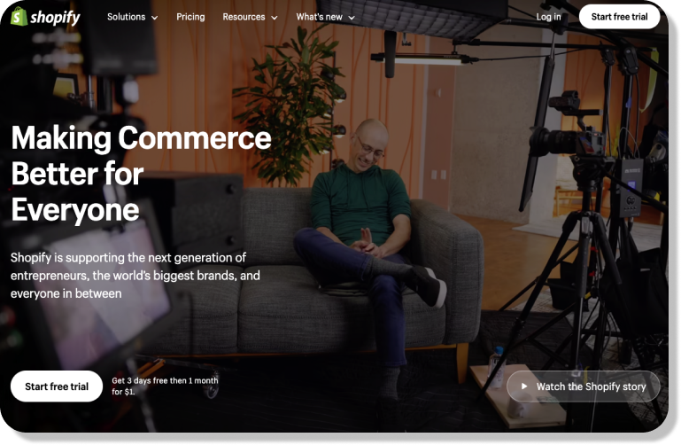
Example of Homepage: Shopify's homepage
Shopify's homepage is a good example of effective homepage. When you land on it, you're greeted with a captivating headline and subheadline that immediately convey the platform's unique value proposition. Additionally, Shopify's homepage design features a captivating hero video paired with eye-catching call-to-action (CTA) buttons, encouraging visitors to either sign up for a free trial or watch the full video.
This combination of engaging visuals and CTAs serves to enhance user engagement and drive conversions.
Landing page is a standalone web page created alongside a marketing or advertising campaign. The primary aim of such a page is to deliver concise and targeted information regarding a specific objective or inquiry such as making a purchase, signing up for a membership, downloading an app, or getting a quote from your business, ensuring direct access for visitors to their desired destination.
In contrast to other website pages with diverse objectives, landing pages focus on a single primary CTA aimed at driving conversions. Due to this concentrated focus, effective landing page must be compelling, prompting users to take the next step with minimal effort.
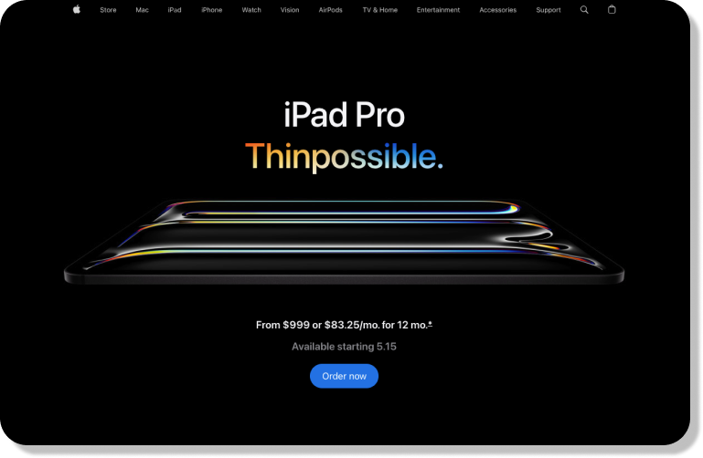
Example of Landing page: Apple's landing page
When you visit an Apple's landing page, the message is unmistakable regarding what they aim to sell. The headline is precise and to the point, providing clear insight into the content, and it also utilizes high-quality imagery to showcase their offerings, ensures it's aesthetically pleasing.
It's call-to-actions are consistently straightforward and easily comprehensible, employing actionable language and leaving no ambiguity about the next steps users should take. Moreover, Apple doesn't merely outline product functionalities but instead emphasizes how these features translate into user benefits.
The About page serves as a narrative hub, unveiling the backstory of a company or individual, such as details about its history, founders, mission, and values, thereby humanizing the brand and fostering a profound connection with the audience.
From a design perspective, an effective About Us page usually spotlights core values through well-structured content blocks or dedicated segments, and utilizes storytelling techniques through visuals, videos, or timelines to breathe life into the brand's mission. Immersive elements such as team photos or glimpses into daily operations can also vividly depict the company's culture.
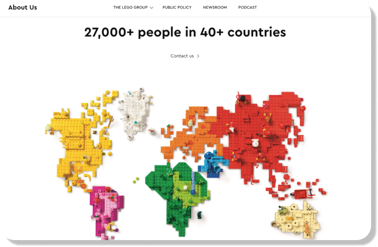
Example of About US page: Lego's About Us page
While LEGO's core product is toys, the primary focus of their About Us page targets parents, who are typically the primary decision-makers when it comes to purchases. The page succinctly outlines LEGO's history in a single sentence, with additional links provided for visitors interested in delving deeper into the brand's extensive timeline.
A vibrant map of the world, constructed entirely from LEGO bricks, serves as a colorful and engaging visual representation of the brand's global presence. This creative depiction effectively illustrates the widespread reach of LEGO across different regions, adding an element of fun and excitement to the brand's narrative.
The Contact Us page, often ignored among other pages, holds pivotal importance in audience engagement. A well-designed contact us page not only facilitates visitor communication but also serves as a reflection of your brand's ethos and dedication to customer satisfaction.
For a effective contact us page, a clean and uncluttered design is paramount, as it minimizes distractions and simplifies the user experience. A minimalist approach streamlines the process of reaching out, emphasizing the inclusion of a well-structured form and easily accessible contact details.
Additionally, incorporating friendly graphics or a map can infuse the page with warmth and accessibility, fostering a welcoming atmosphere for visitors seeking to connect with your business.
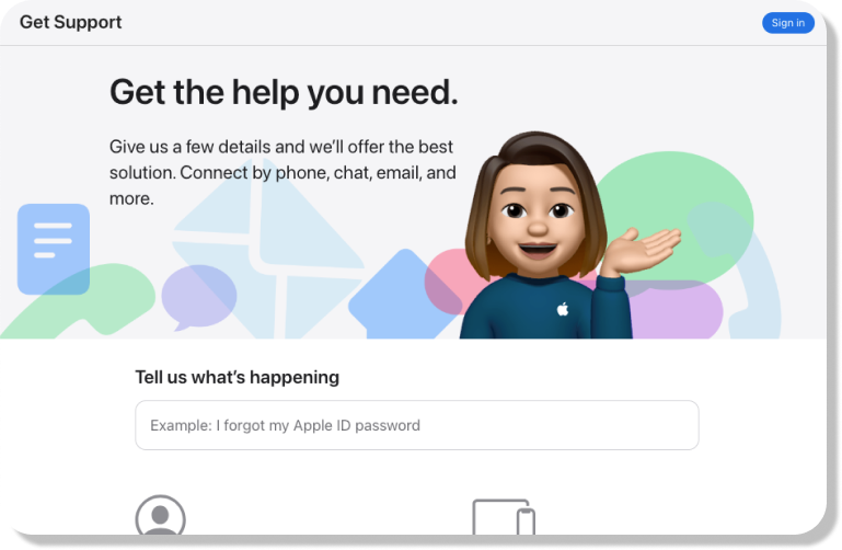
Example of Contact Us page: Apple's Contact Us page
The design of their Contact Us page is straightforward yet efficient, encouraging users to log in for expedited assistance. Apple's support strategy revolves around customization tailored to users' specific products and devices.
Upon signing in, Apple offers intuitive navigation through various topics and categories, alongside the option to enter a device serial number for specialized support, ensuring a smooth and simple user experience.
This is an error page, commonly referred to as a 404 page or "Page Not Found" page, signals that the user has reached the desired domain but the specified URL path contains no information. For instance, a website previously accessible may have relocated to a different address or ceased to exist altogether, resulting in a mismatch between the entered address and the actual location of the site. The 404 error page is intended to provide clarification on the encountered issue.
A effective 404 error page often prioritizes user-friendliness. A user encountering an error message upon visiting your webpage is inclined to navigate away.
So you have to ensure that your 404 page offers clear instructions on how to proceed or provides guidance for returning to the homepage. In this way, you increase the likelihood of retaining the visitor's engagement.
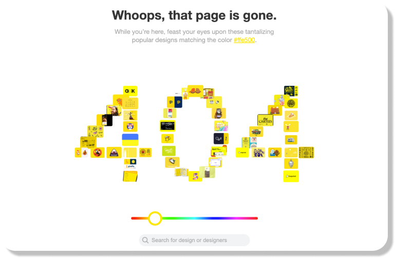
Example of 404 page: Dribbble's 404 page
Dribbble's 404 page ingeniously directs users towards designs sorted by color instead of simply redirecting them to the homepage. This aligns perfectly with Dribbble's core mission of showcasing design work, showcasing their commitment even on error pages. Users are presented with the option to explore designs by color preference or utilize the search function to find specific designs or designers.
Both pathways prioritize captivating design over promoting the Dribbble brand directly, maintaining the platform's focus on creativity and visual appeal.
A product page, a crucial component of an online store, serves as a platform where potential buyers acquaint themselves with a product's features, advantages, and pricing before making a purchasing decision.
These pages typically feature interactive elements enabling users to customize their selections, such as choosing sizes and colors, and adding items to their cart. Beyond these foundational functionalities, product pages often incorporate informative content, including high-resolution product imagery, comprehensive descriptions, customer feedback, and comparative analyses.
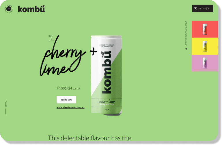
Example of Product page: Kombu's product page
Kombu, a beverage company, demonstrates the power of departing from traditional product page layouts with its bold design. It embraces boldness and innovation, particularly when aligned with the brand's identity, to differentiate oneself in the market and leave a lasting impression on consumers.
The pricing page serves as the primary page on your website, showcasing the various pricing options or plans available to customers, along with the associated benefits and features of each plan. It holds paramount importance as the cornerstone of your website—without a meticulously designed pricing page, you risk losing out on conversions and potential revenue.
Effective pricing pages feature transparent packages tailored to cater to a diverse range of team and company sizes and budgets. Alternatively, if your target users primarily comprises enterprise firms, your messaging should clearly indicate this focus. Rather than displaying pricing details, you might opt for a "Talk to sales" button, ensuring that enterprise buyers can easily request a customized quote.
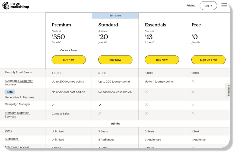
Example of Pricing page design: Mailchimp's pricing page
Mailchimp's pricing page stands out for several reasons. Firstly, it presents a visual representation of feature availability across all offered plans, enabling users to easily see the differences between offerings. Moreover, the page strategically highlights features available on all plans, emphasizing the comprehensive value customers receive regardless of their chosen plan.
Furthermore, Mailchimp employs a price anchoring strategy by prominently showcasing its most expensive packages first, thereby making other price plans appear more budget-friendly in comparison, influencing customers' perception of value.
An ecommerce shopping cart page facilitates the selection, storage, and management of items prior to purchase. Users can conveniently add desired items to their cart, adjust quantities, and view the total cost before finalizing the transaction. A effective shopping cart page is characterized by clarity, simplicity, and speed.
It should present all essential information concisely on a single page, eliminating any clutter or confusion. Utilizing clear language and intuitive design, the cart page ensures straightforward comprehension for users. Moreover, a fast-loading cart page is also essential, as prolonged visitor engagement increases the likelihood of abandonment.
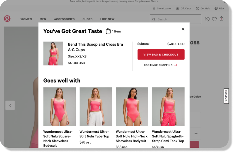
Example of Shopping Cart page: Lululemon's Shopping Cart page
Upon entering Lululemon’s shopping cart, users are greeted with a prominent message at the top, exclaiming, “You’ve Got Great Taste.” Expressing appreciation towards customers for adding items to their cart not only conveys gratitude but also enhances goodwill, aligning well with Lululemon's positive and affirmational branding.
Additionally, Lululemon's checkout button stands out with its large, brightly colored design, capturing users' attention and guiding them to proceed with their purchase. Furthermore, the recommendation of complementary products encourages customers to explore additional offerings, promoting continued engagement and potential upselling opportunities.
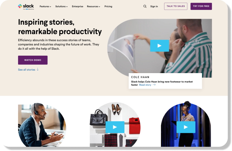
Testimonial page is page that consists of a written recommendation for your company, brand, products, or services that comes from a satisfied customer. It shifts the focus from the seller to the customer, illuminating their experiences and perspectives. Hearing genuine feedback from relatable individuals, who aren't incentivized to promote, fosters deeper trust and boosts the likelihood of a purchase.
Example of Testimonial page: Slack's Testimonial page
Slack organizes its customer testimonials under the section titled "Customer Stories," featuring one company per post. Each testimonial highlights key product features and demonstrates how the customer utilized them, effectively providing a product tour while allowing satisfied customers to endorse the platform.
Its testimonial page caters to those who enjoy reading and those who prefer watching and listening too. Every review includes a succinct quote summarizing how Slack benefited the customer's business, with the option for visitors to delve deeper into the specifics of each case study that often includs a video testimonial.
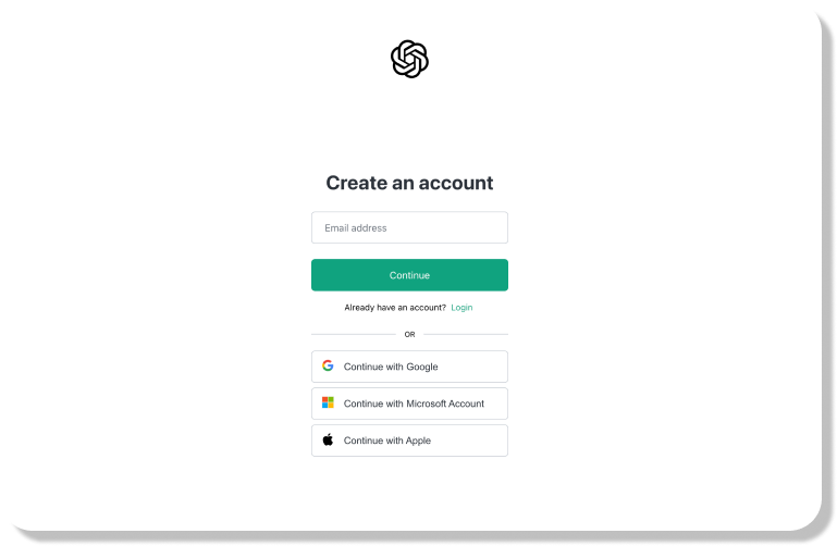
Sign-up page is a page designed to collect information from users who wish to create an account or register for a service, website, or application. Wasting resources on driving traffic to your site, only to lose potential users at the signup stage, is a scenario best avoided. Ensuring an intuitive and compelling signup process is essential for facilitating user engagement and driving business success. An effective sign-up page could significantly impact the number of signups, conversion rates of potential users and overall growth trajectory.
Example of Sign-up page: ChatGPT's Sign-up page
ChatGPT offers one of the most straightforward signup processes online, where users only need to provide their email address to create a free account. Although phone verification is mandatory after form submission, it represents a reasonable level of user interaction. Additionally, users have the option to expedite the signup process by logging in using their Google or Microsoft accounts.
These integrations serve to enhance the activation rate among new users, providing them with alternative pathways to access the platform.
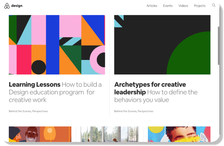
A blog page functions as a website where content is displayed in reverse chronological order, with newer posts appearing first. As Scott Chow from The Blog Starter says, blogs were initially run by individuals or small groups, but have now evolved to include corporate entities producing informative and thought-provoking content.
Example of Blog page: AirBnB Design
AirBnB design page showcases a timeless blog layout, incorporating sections for featured images, titles, and concise information or category for each post. The fonts chosen are crisp and easy on the eyes, significantly enhancing the reading experience.
With virtually no clutter, buttons, or widgets, distractions from the blogs themselves are minimized. In fact, the beauty of the page lies in its simplicity.
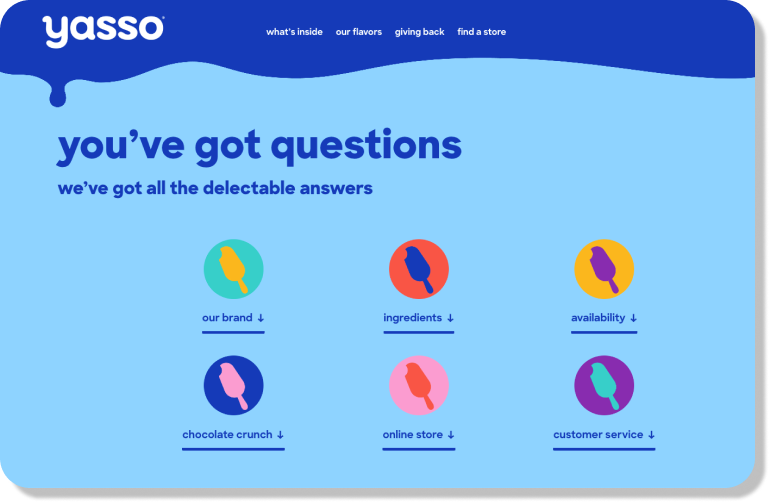
An FAQ page, an abbreviation for "frequently asked questions," is an integral component of a knowledge base as it addresses common customer inquiries and proves beneficial across all stages of the customer journey. Typically structured with questions followed by succinct answers, FAQs enable customers to locate solutions independently, thereby enhancing self-service options and leading to cost savings for businesses.
Example of FAQs page: Yasso's FAQs page
The FAQ page of this frozen yogurt brand, Yasso, begins with a selection of clickable category links, including ingredients, availability, and brand information, facilitating easy navigation for users. Upon clicking on a category or scrolling down, users encounter a drop-down menu featuring more specific questions related to the selected topic, such as ingredient inquiries.
Yasso's FAQ page incorporates the brand's colors and design elements, enhancing brand recall and cohesion throughout the user experience.
The Team page serves as a platform for companies to introduce their employees to website visitors and highlight the organization's personnel. Its primary goal is to provide users with insights into the company's team composition and structure, such as visitors can learn about the company's in-house designers, the size of its creative writers team, and the various divisions within the organization. Through this page, companies aim to showcase the diversity and expertise of their team members, fostering transparency and trust with site visitors.
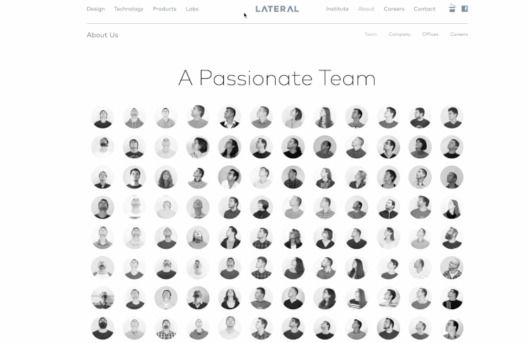
Example of Team page: Lateral's "Meet the Team" page
Lateral's "Meet the Team" page offers a refreshing and innovative approach compared to conventional ones. Instead of a plain list of names and titles, the page utilizes creatively captured images to showcase each team member's personality and humor, providing a glimpse into the company's culture and ethos.
This unconventional presentation enhances engagement and offers valuable insights.
For independent professionals like freelancers, artists, and musicians, a portfolio page offers an efficient way to showcase their work and accomplishments, presenting a concise overview of their skills and achievements. For an effective portfolio page, simplicity is key. One should avoid using excessive design elements that may distract from the content. Including a strong headline that encapsulates the individual's identity and future aspirations is also important.
Additionally, incorporating a variety of work samples such as videos, images, and data can help to demonstrate skills effectively.
Example of Portfolio page: Reut Chen's portfolio page
Reut Chen, a textile designer, opts for a classic grid layout on her portfolio website, where geometric building blocks contrast with her works' organic, textured, and handmade feel. The website's simple, distraction-free design allows her art to take center stage. Breaking away from the grid, she highlights a new project at the top of her homepage, offering visitors insight into her current explorations.

A terms and conditions page serves as a document outlining the regulations and limitations governing the usage of your website, effectively establishing a contractual agreement between your site and its users. While not legally mandated, having such a page can offer essential protection against various issues like user misconduct, infringement of intellectual property rights, and potential legal conflicts.
By delineating the terms of use, a terms and conditions page helps safeguard your site from potential abuses and legal disputes, thereby contributing to its overall security and integrity.
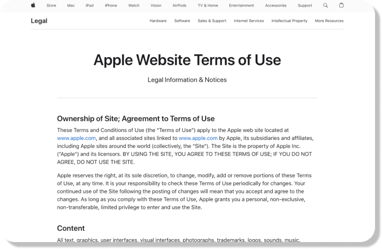
Example of Terms & Conditions page: Apple's terms of service
Apple's terms of service page is refreshingly light compared to its elaborate marketing campaigns. This simplicity underscores the notion that extensive legal jargon isn't always necessary to effectively communicate terms and conditions. Apple's approach demonstrates that concise, straightforward language can convey essential information succinctly.
Actually, there is not a standard or absolute answer to this question. There are various factors that determines the types and numbers of pages your website needs, such as industry, goals, and the desired information for visitors.
For example, an e-commerce website typically requires several key pages such as the homepage, product pages, shopping cart, checkout page, contact us, and FAQs to effectively showcase products, facilitate transactions, and provide essential information to customers. So, you should first identify your target audience and desired actions, whether it's reading an article, learning about features, or making a purchase, and then outline the necessary web and landing pages for your site.
Once you understand the needs and preferences of your target audience and have a plan for what pages you need to create, you can start your design process.
Wireframing or Prototyping: Use tools like Mockplus RP, a fast and free online prototyping tool, to create wireframes or interactive prototypes of your web pages. This allows you to visualize the layout, navigation, and functionality at minimal cost before moving to the next stage.
Visual design: Use tools like Mockplus DT, a free, online UI tool to design, animate, collaborate and handoff in one central place, to proceed with the visual design of your web pages, including color schemes, typography, imagery, and branding elements.
Development: Once the design is reviewed and finalized, you can begin the development process by coding your web pages using HTML, CSS, and JavaScript.
Testing and iteration: Gather feedback from users or stakeholders through usability testing and user surveys. Use this feedback to make iterative improvements to your web pages and enhance the overall user experience.
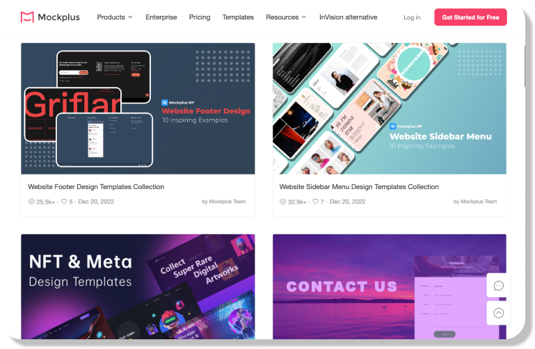
Alternatively, you can kickstart your project with Mockplus's templates library. It offers a plethora of free, captivating and customizable templates, ranging from wireframes to high-fidelity prototypes & UI designs for various types of web pages. There is no need to start from scratch.
Today, we've explored 15 basic types of web pages that you can find on various websites. Whether you're a designer just dipping your toes into web design or a product manager seeking to enhance your site's functionality, grasping these basic pages is essential.
By considering factors such as your target audience and desired user actions, you can tailor your website to meet specific objectives and effectively engage visitors. It's important to remember that your website serves as a reflection of your brand and should adeptly convey your message while also delivering value to your audience.
Hopefully, this article can help you to answer questions like "What pages should I include on my website?" and offers insights into the essential components for creating a compelling online presence.
 Mockplus RP
A free prototyping tool to create wireframes or interactive prototypes in minutes.
 Mockplus DT
A free UI design tool to design, animate, collaborate and handoff right in the browser.
