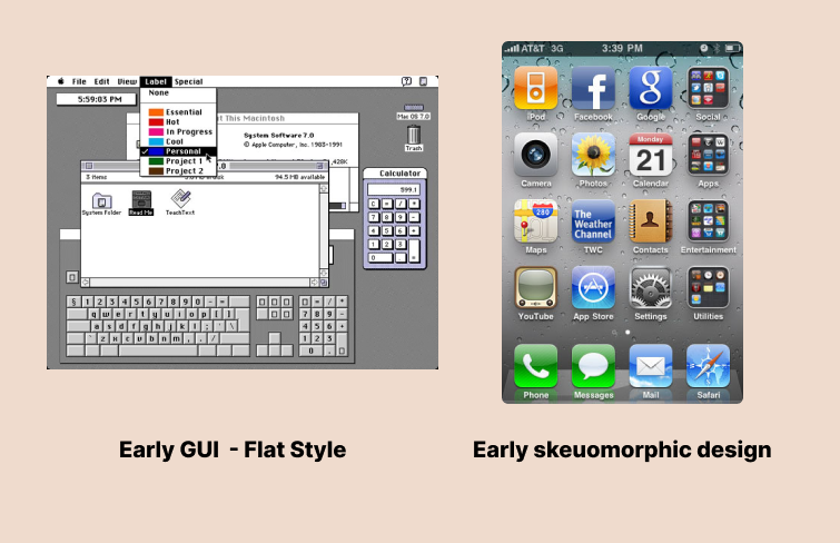
In 1983, Apple introduced the world's first personal computer with a graphical user interface (GUI), bringing this revolutionary concept into everyday life. Early GUIs were predominantly flat due to limited device resolution. As display technology advanced, designers began to pursue skeuomorphic styles, incorporating shadows, highlights, and textures to make digital elements resemble their real-world counterparts.
It aimed to lower cognitive and learning costs for users, particularly new users, by reducing the "unfamiliarity" of digital interfaces.
Over time, the explosion of content richness highlighted the limitations of skeuomorphic design, leading to a shift towards flat design again, which prioritizes simplicity, information clarity, and efficiency. However, in recent years we have witnessed a resurgence in skeuomorphic aesthetics.
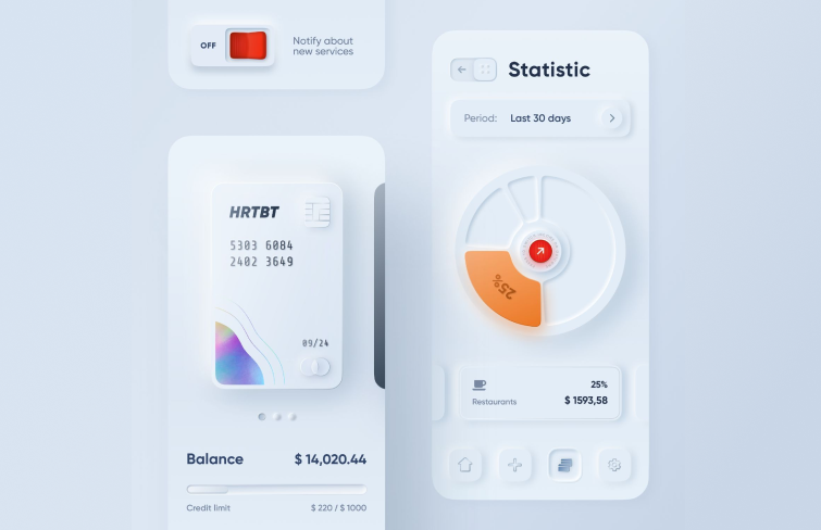
In November 2019, Ukrainian designer Alexander Plyuto released a series of UI works titled "Skeuomorph Mobile Banking," featuring a clean, lightweight, and three-dimensional style that quickly garnered widespread acclaim. It blends the best of both flat and skeuomorphic design principles, reflecting a renewed interest in skeuomorphic design.
Moreover, with the rise of wearable devices, AR, and VR technologies, the significance of skeuomorphic design has become even more pronounced. In this article, let's explore the magic world of skeuomorphic - what skeuomorphism is and how it's different from flat design.
We'll also be sharing some best examples. Let's get started.
What is Skeuomorphism in UI/UX design?
The term "skeuomorphism" combines the Greek word "skeuos," meaning vessel or container, with the English suffix "-morphism," indicating form or structure. This concept dates back to Ancient Greece, where potters crafted handles mimicking metal designs.
In UI/UX design, skeuomorphic replicates real-life objects in digital interfaces by mimicking their qualities, focusing on textures, lights, shadows, dimensions, and usability. Skeuomorphism aims to reduce cognitive and learning costs, making interfaces more intuitive, especially for new users. It provided a sense of familiarity, allowing users to recognize and interact with digital elements as they would with physical objects.
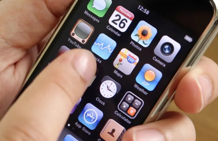
Skeuomorphism UI design gained prominence with the first iPhone. Steve Jobs believed that UI elements should resemble real-life objects to enhance user familiarity and ease of use. And he actually did it. The truth is even elderly users can understand almost all native app icons on an iPhone within seconds.
Skeuomorphic design advantages and disadvantages
Skeuomorphism design offers significant benefits in terms of familiarity, user experience, and visual appeal but also poses challenges related to many aspects. Here are some advantages and disadvantages of skeuomorphism design.
The advantages of skeuomorphic design
1.Familiarity and intuitiveness
When elements resemble their real-life counterparts, users can easily understand their functions and interactions, making digital interfaces more familiar and intuitive for users. For example, icons such as a trash can for deletion or a floppy disk for saving are universally understood, reducing the need for extensive user education.
2.Visual appeal & enhanced user experience
Skeuomorphic designs often have a rich, detailed aesthetic that can be visually appealing and can make digital interactions more enjoyable and engaging. For example, a music player app with a skeuomorphic design that mimics a vintage turntable can evoke nostalgia and provide a richer user experience.
The disadvantages of skeuomorphic design
1.Limitation on creativity and innovation
Skeuomorphic elements can constrain the creativity and innovation of UI design by forcing designers to mimic real-world objects, which can limit the exploration of new and unique functionalities and features. For example, designing a digital calculator to look exactly like a physical one may restrict the addition of new, advanced features that do not have a real-world counterpart, thereby limiting the app's potential usability and functionality.
2.Complexity and clutter
The detailed and textured elements in skeuomorphic design can sometimes lead to cluttered and visually overwhelming interfaces. An app with too many skeuomorphic elements can distract users from the core functionality, making it harder to focus on essential tasks.
3.Increased time and cost for designing and developing
Designing and developing a skeuomorphic interface with intricate textures and details can be more time-consuming and expensive compared to a flat design.
Flat design vs Skeuomorphism
Flat design and skeuomorphic design represent two distinct visual styles in user interface design, each with its unique characteristics and applications.
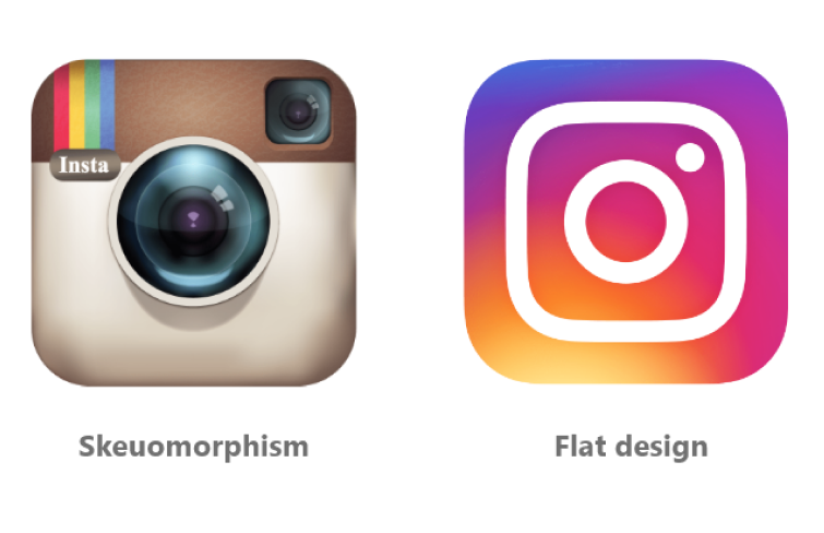
Skeuomorphic design
As we mentioned above, skeuomorphic design mimics real-world objects, incorporating realistic textures and details. This style draws inspiration from the physical world, replicating elements such as buttons, gradients, and shadows to create a sense of familiarity and tangibility. Key features of skeuomorphic design include:
Realistic textures and details: Objects like notebooks, buttons, and dials are designed to look like their physical versions, providing visual cues about their functionality.
Gradients and shadows: Use shadows, highlights, and gradients to create depth and a 3D effect.
Flat design
In contrast, flat design embraces simplicity and minimalism, with vibrant colors and no realistic shadows or textures. This style focuses on clean and straightforward aesthetics, characterized by:
No Realistic shadows or textures: Elements are flat, without the use of shadows or gradients, emphasizing simplicity and clarity.
Vibrant colors: Bright, eye-catching colors are used to create a lively and dynamic interface.
20 best skeuomorphic UI design examples
1.Apple Vision Pro
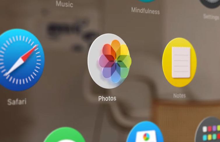
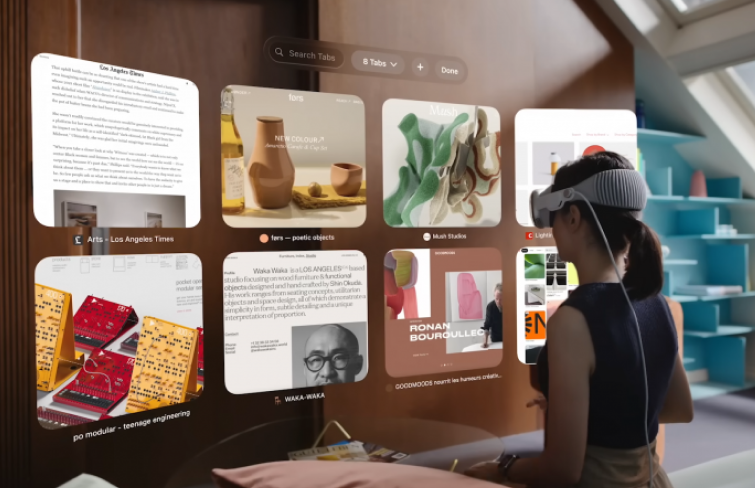
The Apple Vision Pro's UI adopts skeuomorphism from the iPhone and iPad interfaces, serving as a bridge for users entering spatial computing. By leveraging familiar design principles, Apple eases the transition to spatial computing, ensuring that users can navigate and interact with the new technology intuitively. Just like the original iPhone UI mimicked physical objects, the Vision Pro interface creates a sense of physicality with every element.
These elements have dimension and depth, aiding users in understanding scale and distance, which can make users feel comfortable through natural interactions, as if they are moving real objects.
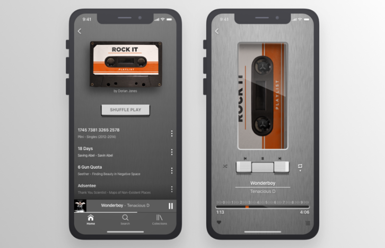
2.Music player by Charlotte Doughty
Charlotte Doughty's music player app combines skeuomorphic design with modern functionality, creating a unique user experience. Its interface mimics a vintage turntable, complete with realistic textures and animations. The turntable spins when music plays, and users can interact with it just like a real record player. The design leverages nostalgia, making it appealing to those who grew up with vinyl records. The tactile feedback and detailed visual elements enhance user engagement, providing a rich, immersive experience that goes beyond mere digital interaction.
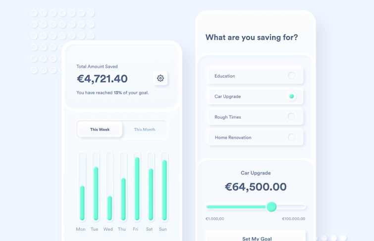
3.Skeuomorphic savings app concept by AK
This skeuomorphic savings app has a super clean interface with each element in the app, from buttons to progress bars, mimics real-world objects such as piggy banks and savings jars.
The use of shadows and highlights creates a sense of depth, making the interface feel tangible. The app's design not only looks appealing but also improves usability by leveraging familiar visual metaphors, making financial management less daunting and more engaging.
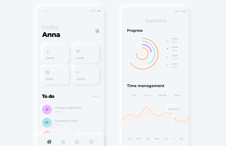
4.Statistics mobile dashboard app by Niraj Gohel
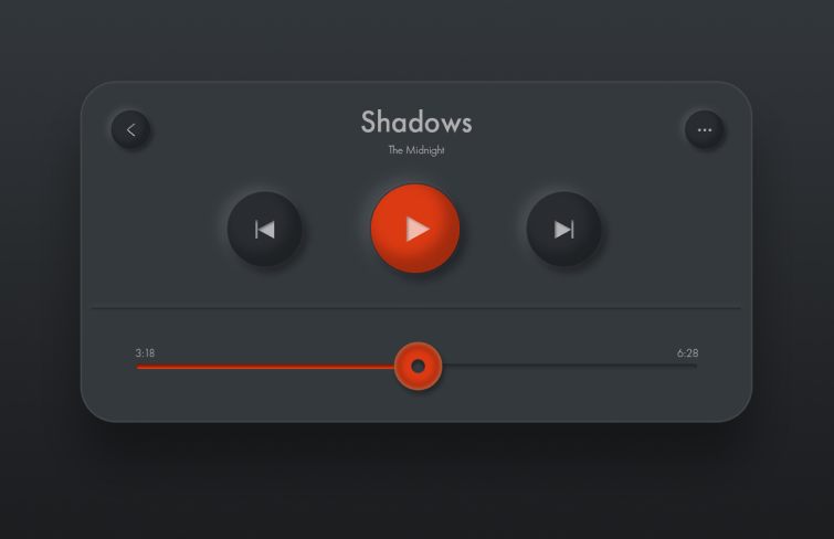
This design's subtle shadows and highlights create a soft, three-dimensional effect, making interactive elements like buttons and sliders intuitive and visually appealing.
Moreover, it's modern, sophisticated color palette complements the neumorphic style, ensuring that the interface is not only beautiful but also highly usable and directing users' attention to key features and data points.
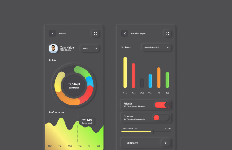
5.Skeuomorphic report app UX/UI black design by Zulqurnain Haider
Zulqurnain Haider's report app design features realistic textures and shadows, creating a visually appealing, functional interface. It's a dark-mode interface with vibrant colors palette, which directly draws users' intention to key elements.
Detailed textures and lighting effects add depth, making the interface feel more engaging and intuitive. The realistic look and feel make it easier for users to navigate and interact with the interface, reducing the learning curve.
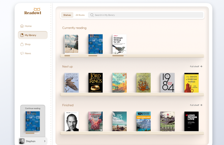
6.Digital books app by Algirdas Jasaitis
Seamlessly blending the tactile familiarity of physical bookshelves with the convenience of digital libraries,
this design creates an immersive reading experience like no other. The lifelike textures and realistic book spines evoke a sense of nostalgia and comfort, reminiscent of browsing through a beloved personal library.
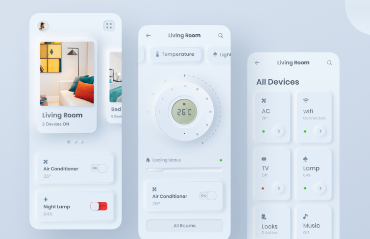
7. Skeuomorphic styled home control app by Pavan
This light-colored and clean home control app interface is effective in providing an intuitive user experience. It leverages familiar real-world objects and their physical characteristics to create a sense of familiarity and ease of use.
By mimicking the appearance and behavior of physical controls like knobs, buttons, and displays, the design reduces cognitive load and speeds up learning curves.
8.Skeuomorphic finance app by Souravuix
By adopting a design style that mimics traditional financial objects,
this example establishes a sense of security and reliability for users. The visual cues, such as the credit card icon and ATM keyboard, trigger positive associations with physical finances, making users feel more confident in using the app.
Additionally, the UI's clear layout, the use of bright colors and clear call-to-action buttons with shadow ensures that users can quickly and effortlessly navigate the app's key functions.
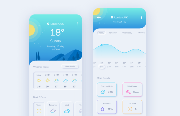
9. Neumorphic weather app by Maria Marin
This
modern and clean weather app UI design is visually appealing, yet functional. The interface mimics physical weather charts and displays, providing a familiar and intuitive experience for users. The blue and white color scheme creates a serene visual experience, while the large, legible fonts and icons ensure ease of readability.
The use of clear weather icons, detailed numerical data, and a logical layout allows for easy understanding of the weather conditions, making it an excellent choice for those seeking accurate and intuitive weather information.
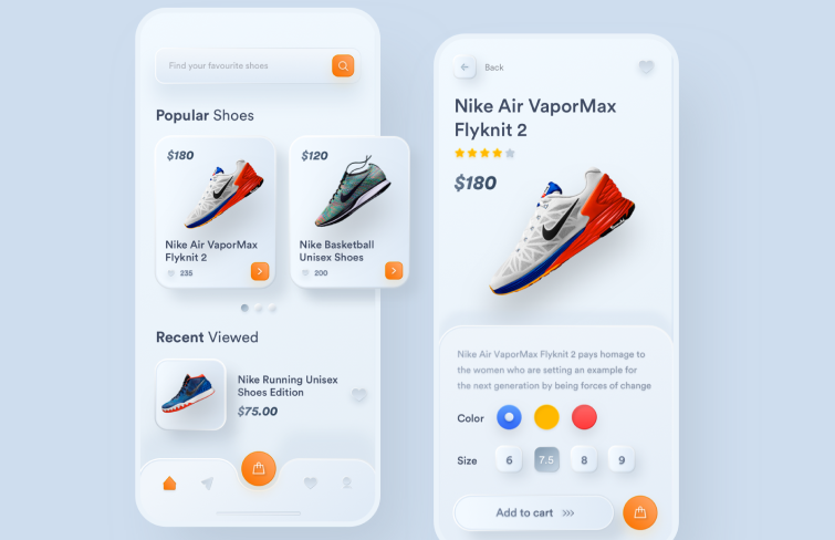
10.Nike shoes E-commerce by Zaini Achmad
The Skeuomorphic UI elements come with subtle shadow, creating a sense of depth and dimensionality. The white-based color palette with vibrant orange accent highlights key information, guiding users' attention. The clear categorization, such as "Popular Shoes" and "Nike Running Unisex Shoes Edition," coupled with detailed product images and pricing, provides a user-friendly shopping experience.
The overall design successfully captures the essence of Nike's brand identity while delivering a seamless online shopping interface.
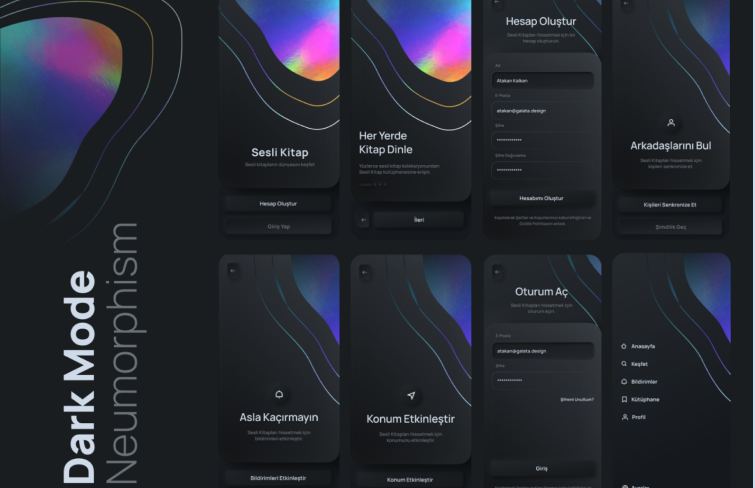
11. Audiobook app by Atakan Kalkan
The
Audiobook app's design offers a visually stunning and user-friendly interface. Firstly, the use of highlights and shadows adds depth and realism to the interface. Secondly, the dark theme with gradient colors and abstract shapes provides a visually appealing and modern look. Finally, the clear layout and organization of elements, such as labels, buttons, and menus, enhance usability and navigation.
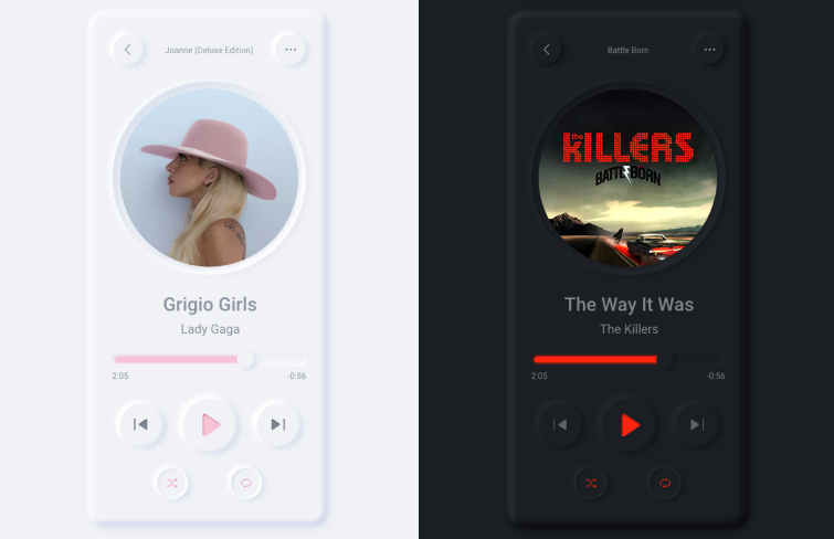
12. Music app by Paulina Corona
This
skeuomorphic music app showcases a well-balanced design that effectively leverages skeuomorphic UI elements. The circular album covers mimic physical CDs, enhancing familiarity and user experience. The shadows around these UI elements like play/pause and progress baradd depth and dimensionality, making them appear more realistic and tangible.
Moreover, it also offers choices between light and dark modes, which provides users with more flexibility and customization options. The light mode, with its white and pink hues, provides a soft and feminine touch, ideal for those who prefer a lighter and brighter interface. On the other hand, the dark mode not only reduces eye strain in low-light environments but also creates a more immersive and intimate listening space.
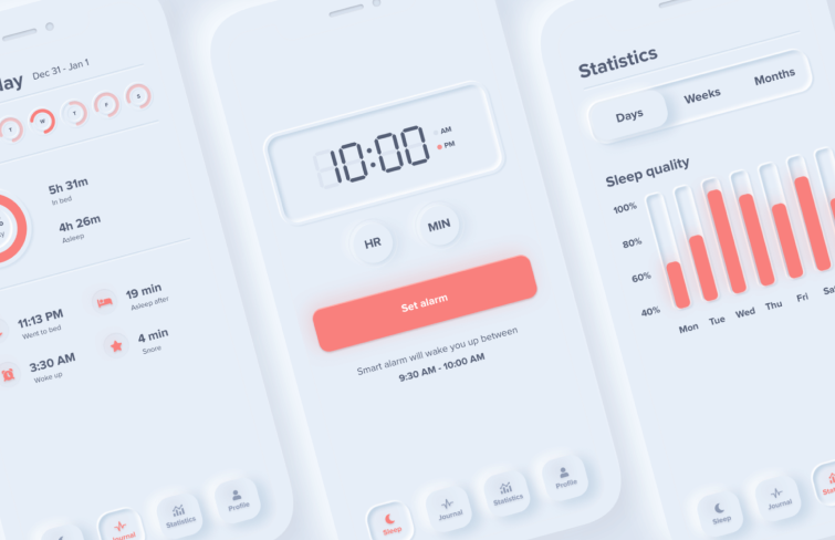
13.Sleep cycle app by Devanta Ebison
The
sleep cycle app's interface excels in both functionality and aesthetics. Its modern minimalistic design with white and red hues creates a calming ambiance for sleep tracking and also highlights key information. Its uses of skeumorphic elements like the timer, alarm setting, tab and activity timeline add familiarity and ensure that users can navigate and interact with the interface intuitively.
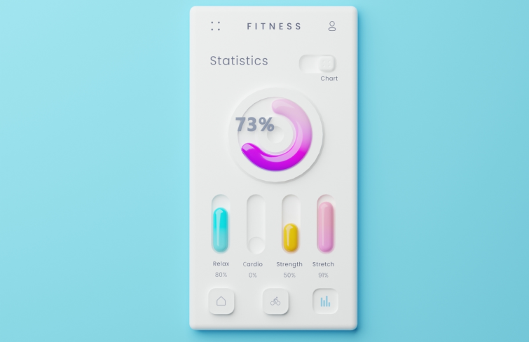
14.3D fitness app UI by Dmitry Kalionau
This
3D styled fitness app's UI features a sleek design. Its skeumorphic elements are subtle, yet effective in creating a three-dimensional feel with rounded corners and soft shadows. The pink-purple color palette complements the white and light blue background, conveying a sense of energy and vitality. Its circular chart and well-spaced buttons enhance usability while maintaining visual harmony.
Moreover, the slight gradients and shadows add depth, making the interface not only visually appealing but also intuitive to navigate.
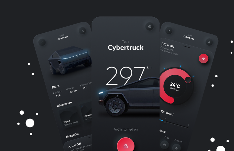
15.Tesla app by Menai Nizar
The
Tesla App by Menai Nizar is highly effective, blending futuristic aesthetics with intuitive functionality. The deep color palette complemented by white and red accents creates a sleek, modern look. The soft shadows and rounded edges add depth and texture, enhancing the visual appeal. Vehicle information and controls are logically grouped, simplifying user interaction.
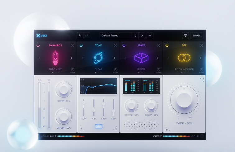
16.Audio plugin interface by Voicu Apostol
Its
minimalistic Skeuomorphic UI elements like rounded corners and slight shadows create a sophisticated yet familiar interface. The overall color scheme of white with blue and purple accents offers a clean and modern aesthetic. The control panels and key elements of the plugin are highlighted through focused lighting. This not only draws the user's attention to important parameters but also helps create a hierarchy within the interface.
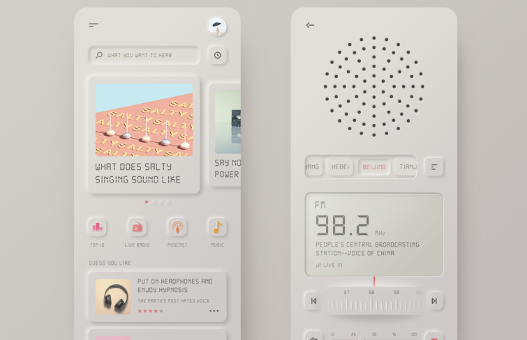
17.Vintage radio by Xiaoming Phan
The
vintage radio app's interface showcases a unique blend of retro and modern design elements. Its fusion of vintage radio aesthetics with contemporary functionality makes for an intuitive and engaging user experience.
The Skeuomorphic UI brings nostalgia through rounded corners and tactile buttons.Besides, its subtle incorporation of color gradients and typography highlights key information, enhancing usability and accessibility.
18.Skeuomorphiс hello dribbble by Ilgiza
The
Hello dribbble app interface excels in its utilization of light and shadow to create depth and texture, effectively mimicking 3D effects. The pink color scheme not only adheres to Dribbble's brand identity but also cultivates a warm and inviting atmosphere. The white title and options stand out brilliantly against the pink backdrop, providing a sharp contrast.
19. Spotify app by Vincent Melgers
The deep colors of
this Spotify interface contrasted with the characteristic green hue seamlessly align with Spotify's brand identity, fostering recognition and loyalty. Design elements like the circular icons and typography are minimalistic yet impactful, focusing the user's attention on key information. The subtle shadow gives the illusion of depth and dimensionality, creating a floating appearance for the interface elements.
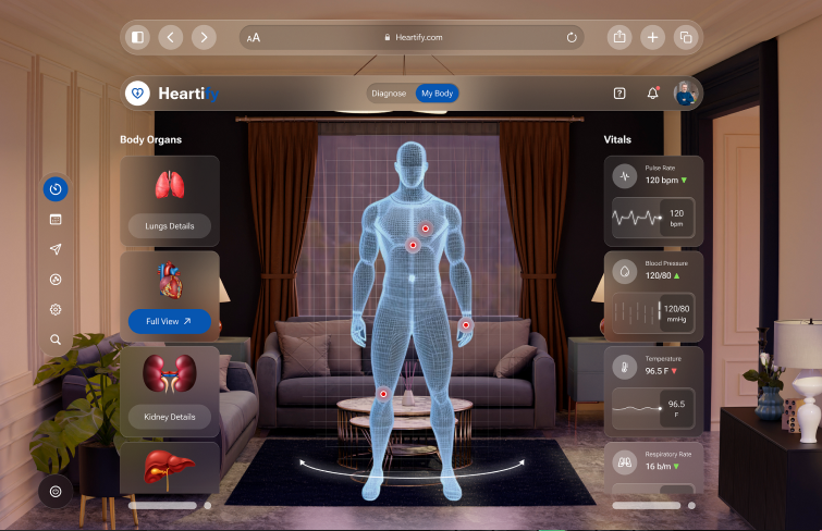
20.Patient health monitoring AR by Dheeraj Dabhi
The
patient health monitoring software's AR interface boasts a superior design. It creates a 3D model that intuitive representation of body organs, making it easy to understand. The transparent background allows the user to seamlessly interact with their surroundings.
Shadow effects enhance the 3D feel of the interface, while design elements such as the pulse rate, blood pressure, and temperature indicators are visually striking yet functional, ensuring a seamless user experience.
How to create skeuomorphic designs?
Creating skeuomorphic designs involves imitating real-world objects in digital interfaces. To achieve this, designers should focus on the following key steps:
1.Identify the real-word counterparts
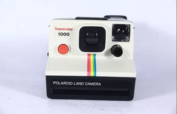
Start by selecting a physical object you want to replicate, such as a notepad or a camera.
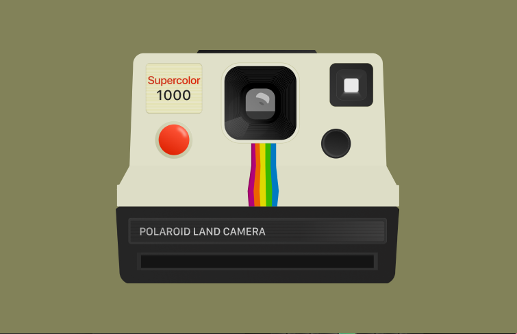
2.Design the flat base
Use design tools like
Mockplus DT, Figma, Adobe XD to design the shape and outline of your design elements and interface. Once the shape is defined, fill each segment with solid colors. This step helps in establishing a clean, flat base for further detailing.
3.Add textures and shadows
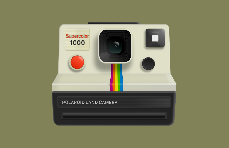
Incorporate realistic textures, such as wood grain or metallic surfaces, to give depth and a tactile feel to your design. Shadows and highlights are essential to create a sense of realism and three-dimensionality.
FAQs
1.Is skeuomorphism outdated?
No. While some designers argue that skeuomorphism is outdated, it still has its place in modern design. It can be effective in creating a sense of familiarity and ease of use, especially for complex interfaces. Moreover, as we mentioned above, with the rise of wearable devices, AR, and VR technologies, the significance of skeuomorphic design has become even more pronounced.
2.What are the characteristics of skeuomorphism?
Skeuomorphism is characterized by its imitation of real-world objects and materials. It often includes realistic textures, shadows, gradients, and other visual cues that mimic the physical world. Skeuomorphic designs aim to create a sense of familiarity and ease of use by replicating familiar objects and interfaces.
3.What is the main problem with skeuomorphism?
The main problem with skeuomorphism is that it can sometimes become overly gimmicky and cluttered, leading to visually overwhelming interfaces. Because skeuomorphic designs often mimic real-world details, they can include unnecessary visual elements that detract from usability.
4.What is the difference between skeuomorphism and neomorphism?
Neomorphism, or "new skeuomorphism," is often seen as an evolution or reinterpretation of traditional skeuomorphism. While both design styles focus on creating depth and a sense of realism, they approach these goals in different ways. Skeuomorphism aims to replicate real-world objects and materials, while neomorphism focuses on creating a design with subtle shadows and gradients. Neomorphism emphasizes simplicity and elegance, while skeuomorphism prioritizes realism and familiarity.
Conclusion
Ok, that's all for today's article. We have took a comprehensive look at Skeuomorphism which is sometimes debated, but remains a valuable tool in the designer's arsenal. By carefully replicating real-world objects and materials, skeuomorphic designs can create a sense of familiarity and ease of use. However, it's important to use this style with intention and restraint, avoiding gimmicky or overly realistic designs.




 Mockplus RP
 Mockplus DT
