Minimalism has become an overwhelming trend in current website design. And increasing number of designers have accepted this influential design style and widely used it in their designs. However, as an art of less, designing such minimalist websites does not mean to delete the elements of a website without any restriction.
Conversely, as a UX/UI designer, you are supposed to make the most beautiful, eye-catching and functional minimalist websites with much less and simpler elements/blocks.
Does that sound a little bit tricky to balance? Or do you merely want to know how to make such simple, clean and amazing minimalist websites? Are you looking for some practical design secrets or best practices/examples for inspiration? Look no further. Here are 9 of the best design secrets/principles and some of the newest and best minimalist website design examples in 2018 summarized below for you:
The minimalist website design style often indicates a design approach that UX/UI designers are trying to simplify their web interfaces and interactions by deleting unnecessary elements.
But, it does not mean that you can remove the site elements blindly without limitations. Instead, you are supposed to use the least components/elements for creating the most functional and simplest websites.
And in this aspect, a brilliant prototyping tool, also known as Mockplus (which helps designers design, make, test, iterate and share a website prototype in an easier, faster and smarter way), can help you in making a creative and attractive minimalist website.
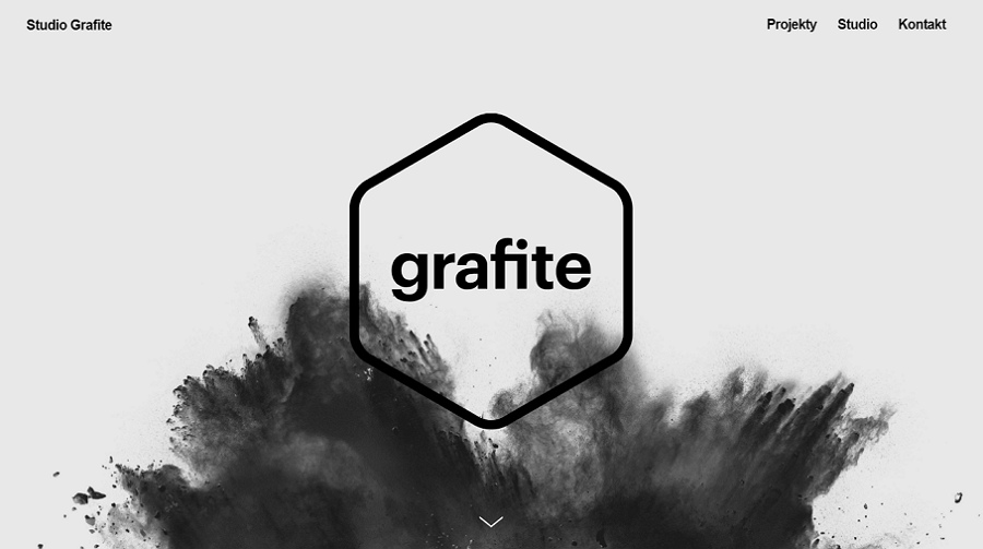
Here are some common reasons to help you decide whether it is necessary for you to implement the simple, clean and intuitive style of minimalist website design:
*Minimalist websites are usually easy-to-use and offer a better user experience.
*Minimalist webs are simple and responsive.
*Simple, clean and intuitive interfaces serve busy users better.
*Minimalist websites load faster, which can effectively reduce web bounce rate.
*Simple and clean websites enable users to naturally focus on the page contents/services.
In short, the minimalist website design style is a design style that can meet the needs both of designers and users. It is not only one of the hottest web design trends in 2018. It will continue to be popular for quite some time.
So, in this regard, it is really necessary for you to know and learn some minimalist website design skills as a UX/UI designer.
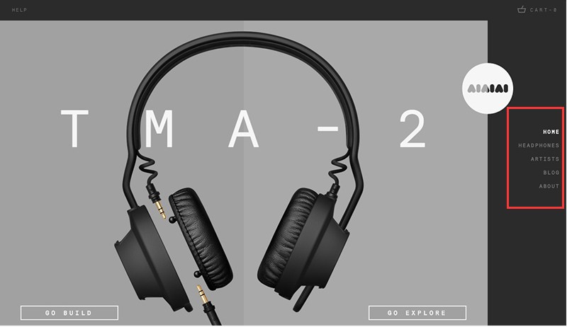
Simple and clean websites enable users to naturally focus on the products.
Since minimalism in website design is so effective for creating an intuitive and attractive website, let's take a look at similar minimalist websites to learn their secrets?
Here are 9 useful design secrets and latest website design examples (some of them are made by Mockplus, an easier, faster and smarter prototyping tool and can be really inspiring to you) to help you to build beautiful and functional minimalist webs:
Unlike the whitespace in paintings (which is full of mystery and gives audiences unlimited imagination space), the whitespace (also called negative space) in website design tends to reduce noises in web pages and allows users to naturally concentrate on the page contents, products and services advertised. This is a practical way to increase product sales.
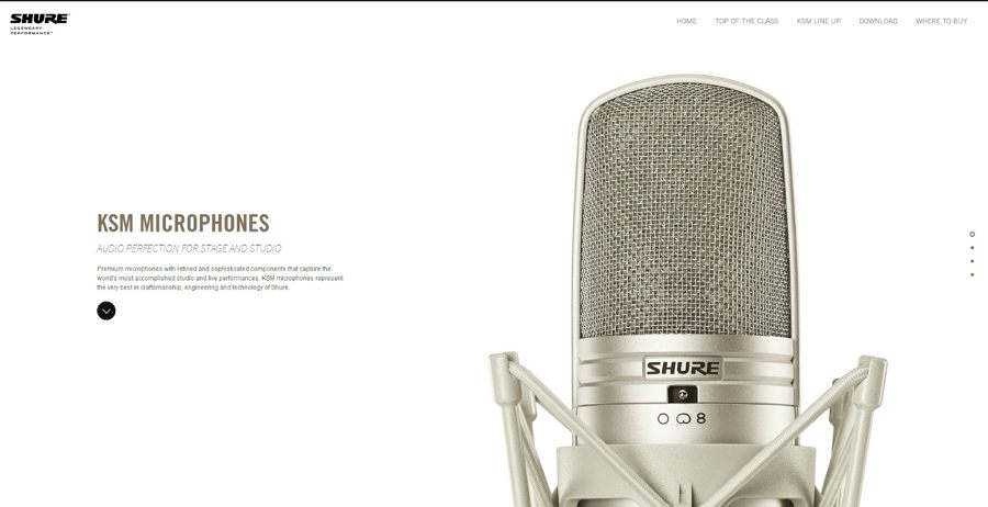
Use whitespace to highlight page contents and services.
Like the example above, whitespace highlights your website content and guide users to click, purchase or read more.
Simple and bright colors not only make your websites visually appealing, but also help to divide interface functions. So, you’d better use simple colors wisely to make your website pages attractive. Below are some rules of thumb to follow:
*Use simple colors/color schemes wisely to catch users’ attention quickly
Minimalist websites do not have to adopt one color or a black & white color scheme for simpler pages. Honestly, even using one color, you can also change color opacity, use color gradients, add color shapes to make your designs different.
It is recommended that only one, two or three colors are used in a website design.
So, it is better for you to use simple colors/color schemes wisely to catch users’ attention at first sight. (Click to learn how to use color in UI design wisely )

Use colors in the same color system to make your website simple and beautiful.
Of course, you’d better not use too many colors in a website if you do not want to make your webs more complicated visually.
Similarly, a white & black color scheme can both appealing and fashionable:
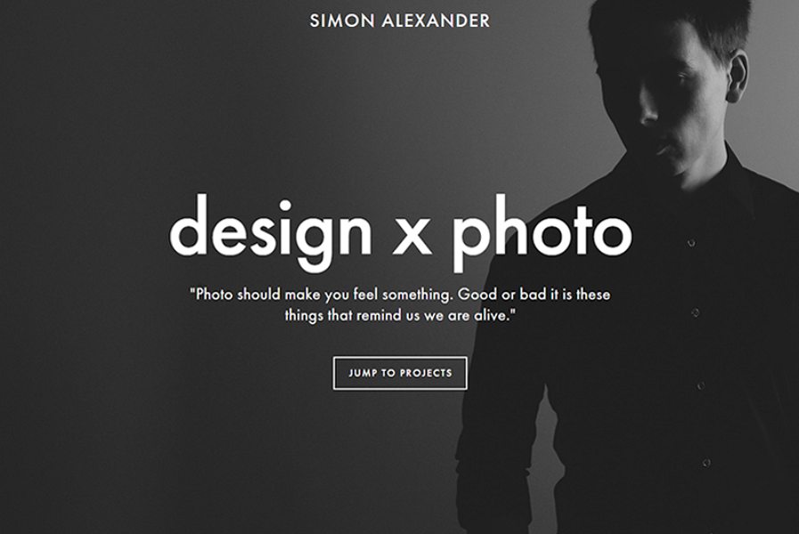
A website with a simple black & white color scheme can be fashionable and unique.
*Use color blocks to divide interface functions
Are you afraid that too simple a design will negatively affect the functions of your websites? Have no fear. It is simple to avoid such problems through the use of color blocks to divide interface functions more intuitively.
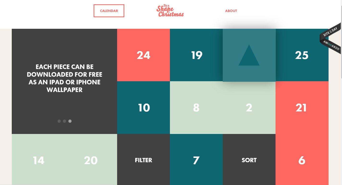
Simplify your website interface with color blocks.
Similarly, you can use “Shape”, “Image”, “Label”, “Text Area” and more components in combination with color changes to get such color blocks for simpler minimalist website prototypes in Mockplus.
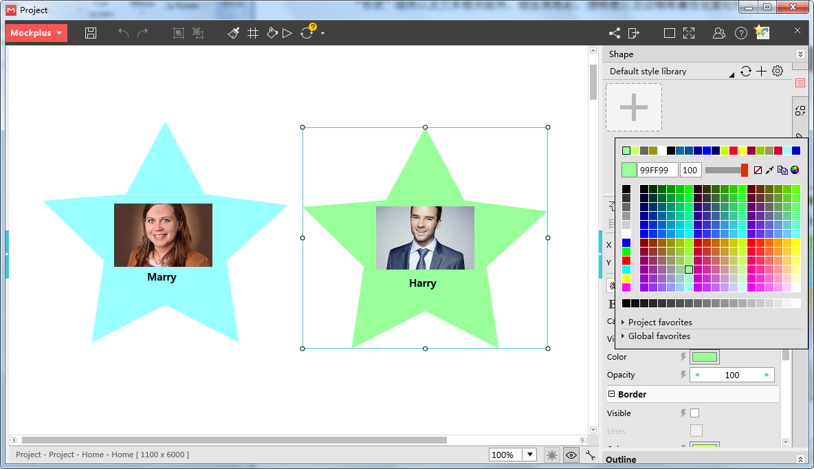
You can use Mockplus to create color blocks easily with “Shape”, “Image”, “Label”, “Text Area” and more components.
*Use color contrast to make your website eye-catching
Color contrasts can not only enhance the functionality of your websites, but also make your website more the visually appealing.
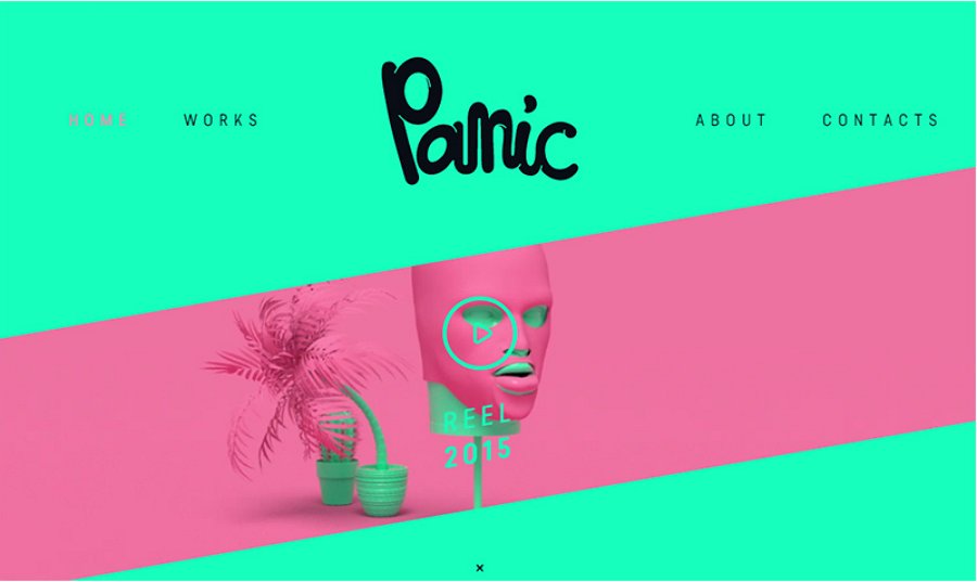
Use strong color contrasts to make your website eye-catching.
Overall, wisely use simple colors or color schemes to simplify your websites and enhance its visual impact.
Besides colors, well-crafted interface texts, fonts and typography can also make your minimalist websites appealing and help to create clear hierarchies of every page to tell users which part is important even at a quick glance.
Below are some ways for you to optimize your webs with hierarchical fonts and typography:
*Simplify UI texts to make your web pages more intuitive and user-friendly
Simpler words, sentences and forms (such as some widely-used subtitles or lists) often contribute a lot to making your web more intuitive and user-friendly.
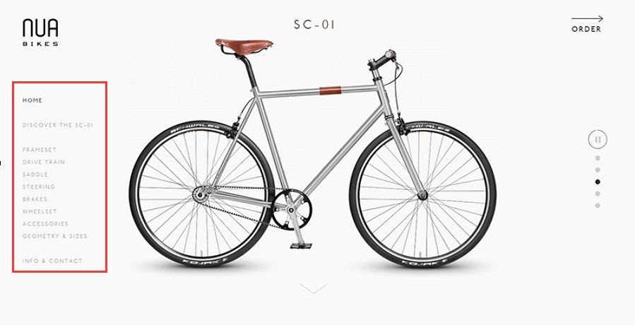
Use more intuitive lists to show your interface texts.
*Create text hierarchies with text fonts and typography
Excellent minimalist websites often do not use many text fonts or typography. Actually, even when you use only one text font or typography, you can still create clear text hierarchies with the changes of text sizes, colors, line-heights, alignments, positions and other properties.
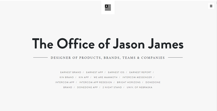
Texts in different sizes, fonts and positions help create a clear hierarchy of your website.
In this aspect, you can easily use “Label” and “Text Area” components of Mockplus to add texts to your minimalist website and set their properties easily to create intuitive text hierarchy. For example, you can freely edit the colors, fonts, opacity, sizes, borders, visibility, line spacing, markups, remarks, external URL and other properties of these text components.
Overall, using hierarchical text fonts and typography is an excellent way to optimize the design of your minimalist websites.
One of the basic principles of minimalist website design is “less is more”. When words cannot help explaining the website functions or services clearly, you can directly simplify complex instructions by pairing them with proper photos or images, which are often better than thousands of words.
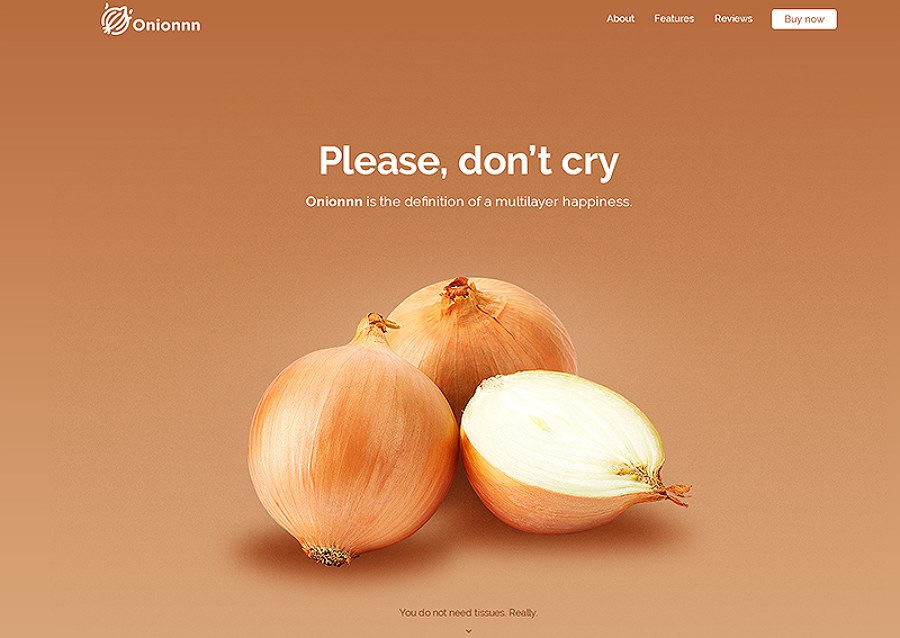
Use proper photos to explain your page texts more clearly.
And in this regard, with Mockplus, you can freely try its “Image” or “GIF” components to easily import static or dynamic photos. If possible, you can also import images in batches at a time with “My libraries”. Moreover, in Mockplus, you can also import Sketch and icons needed easily.
In addition to color blocks, you can also use grids to intuitively divide interface functions and guides users to find their needed page contents quickly.
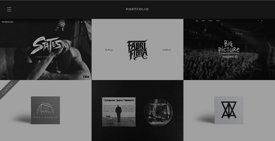
Simple grids make your website more intuitive and easy to use.
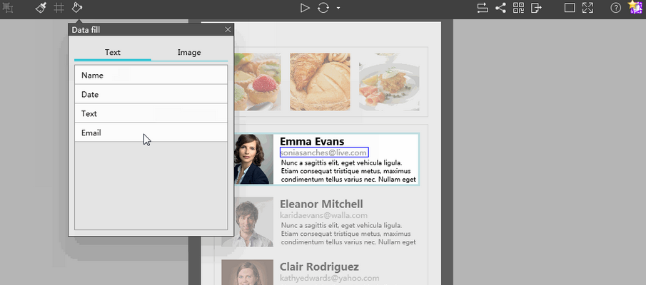
And you can easily use “Repeater” and “Auto Data Fill” features (which enable you to automatically fill texts or images in batches and help reduce your workload ) of Mockplus together to quickly create your website grids.
Even in minimalist websites, website menus and navigation bars are essential parts for good user experience. Therefore, you’d better not ignore the menus and navigation bars in your design.
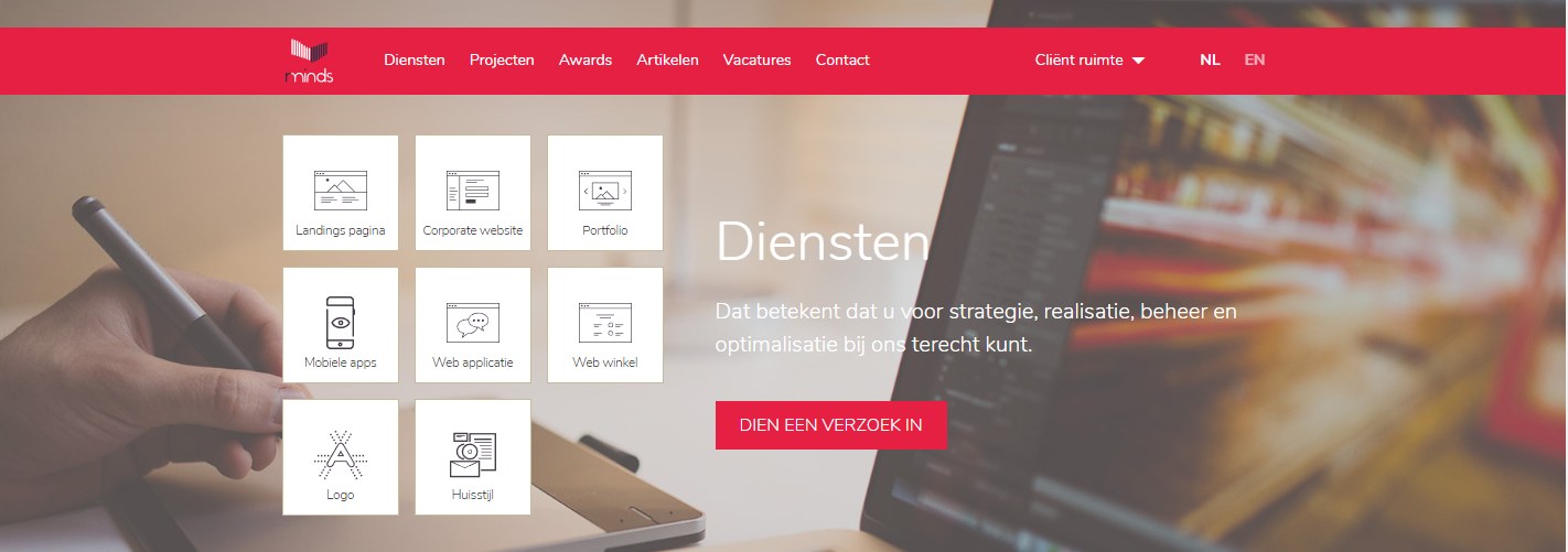
Use intuitive navigation bars to guide users and improve UX.
In order to make your minimalist webs unique and attractive, you can also try to optimize your websites with other design styles, techniques or skills as below:
*Simplify your websites with progressive disclosure techniques
The progress technique is often used by designers to simplify their UI designs of a mobile app/website. And users can easily click a button or link to switch to other parts of the web/app and read more details. Therefore, in your minimalist web designs, you can also use this technique to make your website simpler.
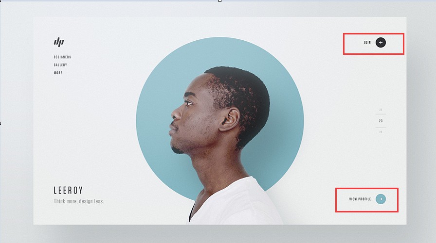
Use the minimalist design style and progressive disclosure technique together to simplify your website.
*Optimize your websites with the flat design style
The flat design style, another hot website design trend, can make your minimalist webs simple, clean and visually appealing. And you can also use minimalist design styles and flat design styles together to simplify your websites as below:
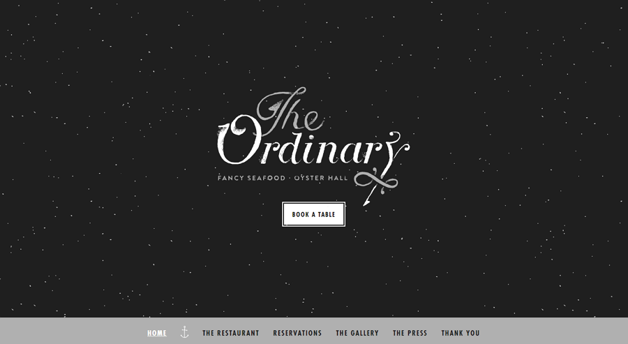
*Choose a design theme based on the features of your websites/products
In your design, you can also use colors, icons and photos to show a consistent design theme based on the features of your website/product.
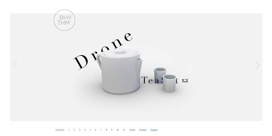
Show product photos dynamically in Home Page to impress users and increase sales.
*Create a unique minimalist website with your creativity
Every detail of your website can show your creativity and help attract more users. So, you’d better pay attention to every detail and create a unique and outstanding website with your creativity.
Overall, you’d better try to optimize your minimalist websites with other design styles, techniques and skills.
There are also many commonly-used web design strategies that you can draw from for inspiration.
For example, you can add a commonly-used navigation bar (that often includes 5 basic parts, such as the searching box, website icon, related site tool, the way back to Home page and navigation bar, etc, ) to guide customers.
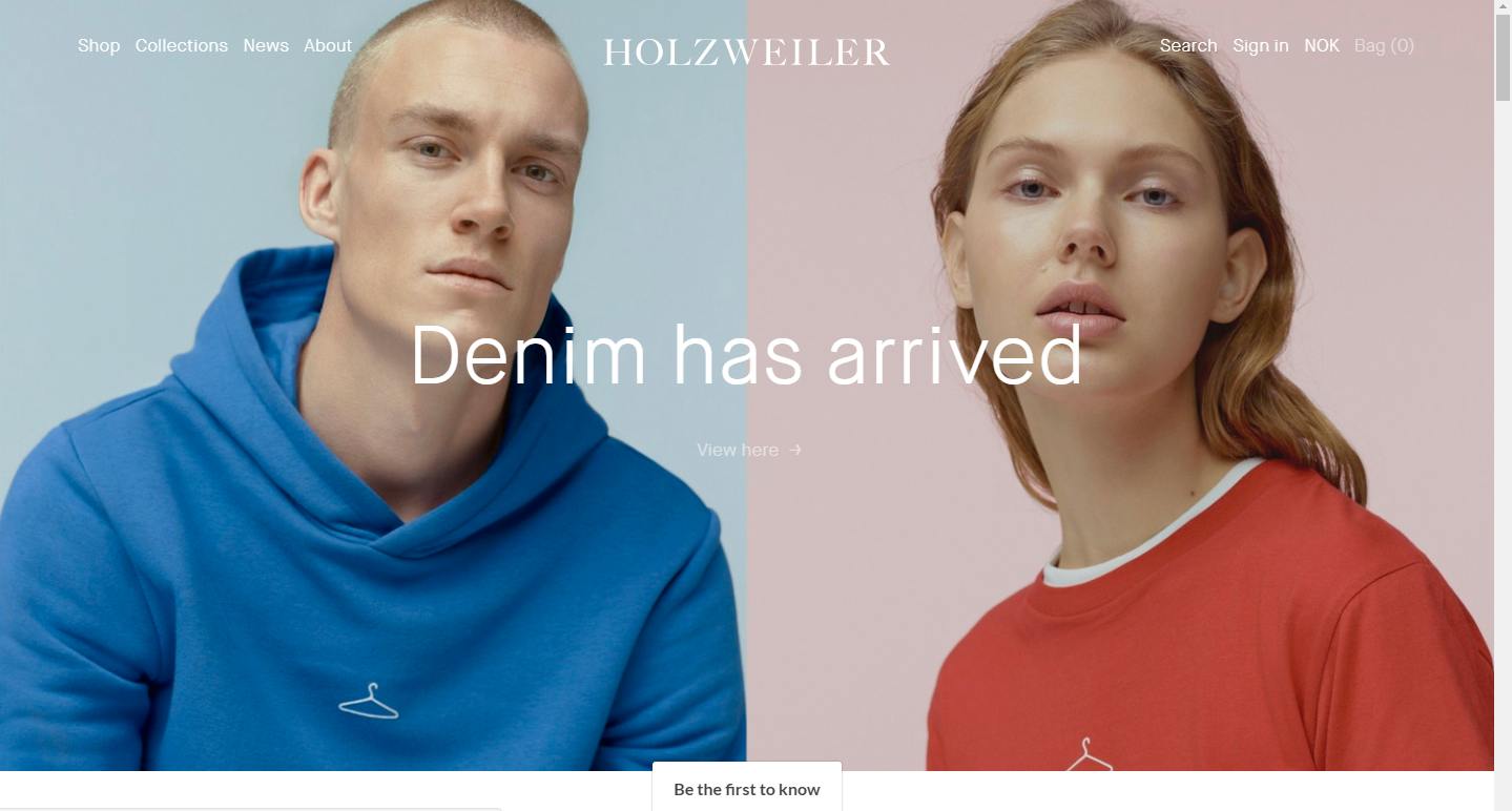
And you can also design an enticing CTA button with a “square” shape and external link to increase the click rate. You can also use a magnifier icon to highlight the searching feature of your website and add sidebars/hidden bars to extend the page functions.
In short, you can implement some commonly-used web design strategies to make your website easy-to-use and simplify the designing processes as well.
Minimalist website design is a design approach that enables designers to use limited elements to create the most functional websites. So, each of these elements matters a lot.
For instance, in your design, you can try to optimize your websites with unique logos, color schemes, grids, fonts, geometries, simple interactions/animations and other details.
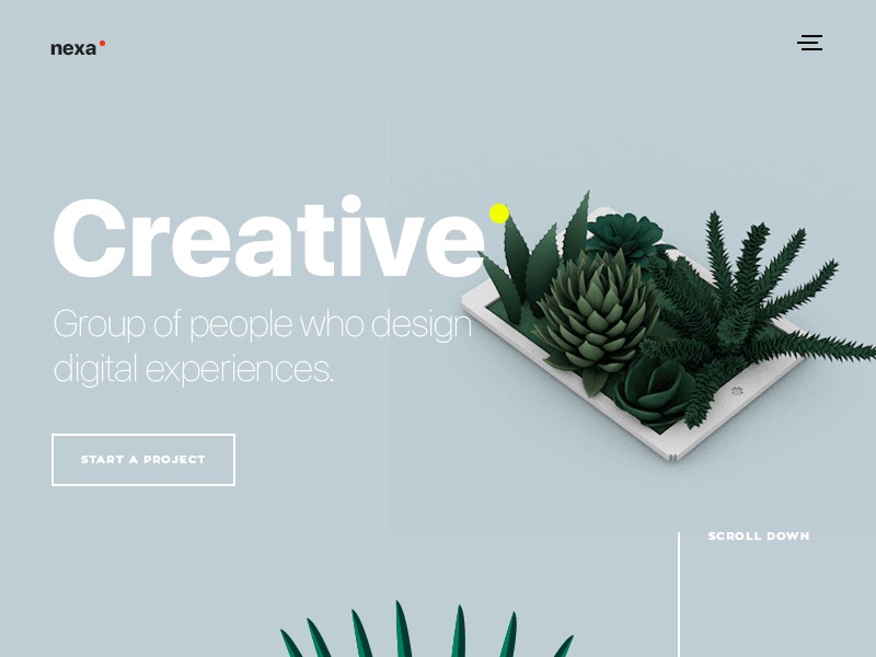
Small animations can make your minimalist website eye-catching and help attract more users.
And in this aspect, you can easily use Mockplus to add interactions to your website prototypes. The State Interaction that enables designers to add hovering effects is also worth trying for you.
In short, even a very, very tiny detail can make your website stand out and its impact cannot be underestimated.
Overall, hope all these design secrets and examples mentioned above can help you anyway.
Below are also some additional tips to help you simplify the design process of your minimalist websites:
To prevent inadvertently missing important elements or functions, you’d better show all elements needed and try to simplify them one by one then.
And in order to check the different effects before or after you’ve simplified or removed an element, it is better for you to use an excellent prototyping tool, such as Mockplus, to test them carefully. Moreover, Mockplus offers 8 ways to test and share a project. You can use this feature to collect feedback from designers and users quickly.
Tiny details are sometimes what makes a website unique and help attract far more users. So, take your time to recheck or redesign the tiny details of your minimalist webs. Recheck! Recheck! Recheck!
While paying much attention to details, you’d better not forget the overall uniformity. A minimalist website page should have a consistent color scheme, consistent design theme and more. Pages lacking cohesion and consistency make user confusing and brings users bad experiences.
So, you’d better also spend your time in keeping your entire minimalist website consistent.
In fact, no matter which type of website design style you choose, you are always supposed to test your website design works with the help of useful prototyping tools, such as the powerful Mockplus mentioned above.
In Mockplus, you can freely use its powerful component library and Component Style library (which enables designers to save, reuse and share styles of components easily with one click) to create your interactive minimalist website prototypes quickly and easily. Its powerful icon library with over 3000 SVG icons is also very convenient for designers to add and edit icons needed for their simple and clean websites.
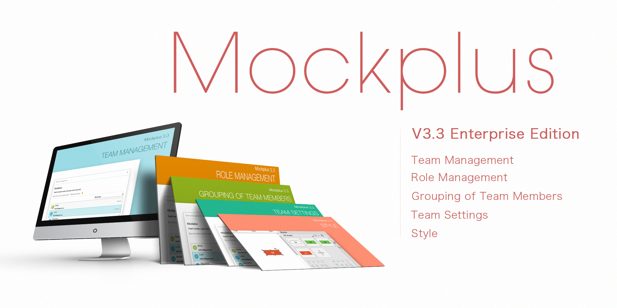
In addition, its brand-new team management and collaboration feature of the newly-released Team and Enterprise editions is also worth trying for better team collaboration.
 Wrap Up
Even though the minimalist website design brings people many benefits, it is not suitable for all websites. In fact, when it comes to yellow page type websites that offer visitors useful sources and information in all walks of life, too simple a design may make users confusing and decrease the authority/credibility of their provided information.
So, it is better to choose a minimalist design style based on the features of the different websites/products as well as the needs of the target audiences and real users.
Of course, it is also important to test and improve your simple, clean and functional minimalist web designs with the help of the best prototyping tools, such as Mockplus.
In all, hope this article with useful design secrets and examples will be helpful in your design of a beautiful, outstanding and functional minimalist website.
 Mockplus RP
A free prototyping tool to create wireframes or interactive prototypes in minutes.
 Mockplus DT
A free UI design tool to design, animate, collaborate and handoff right in the browser.
