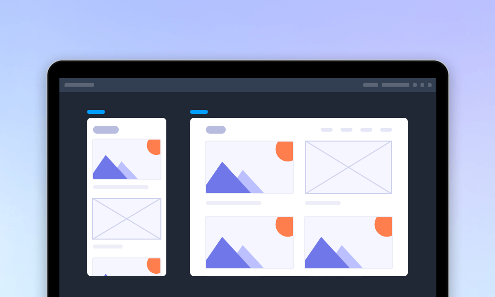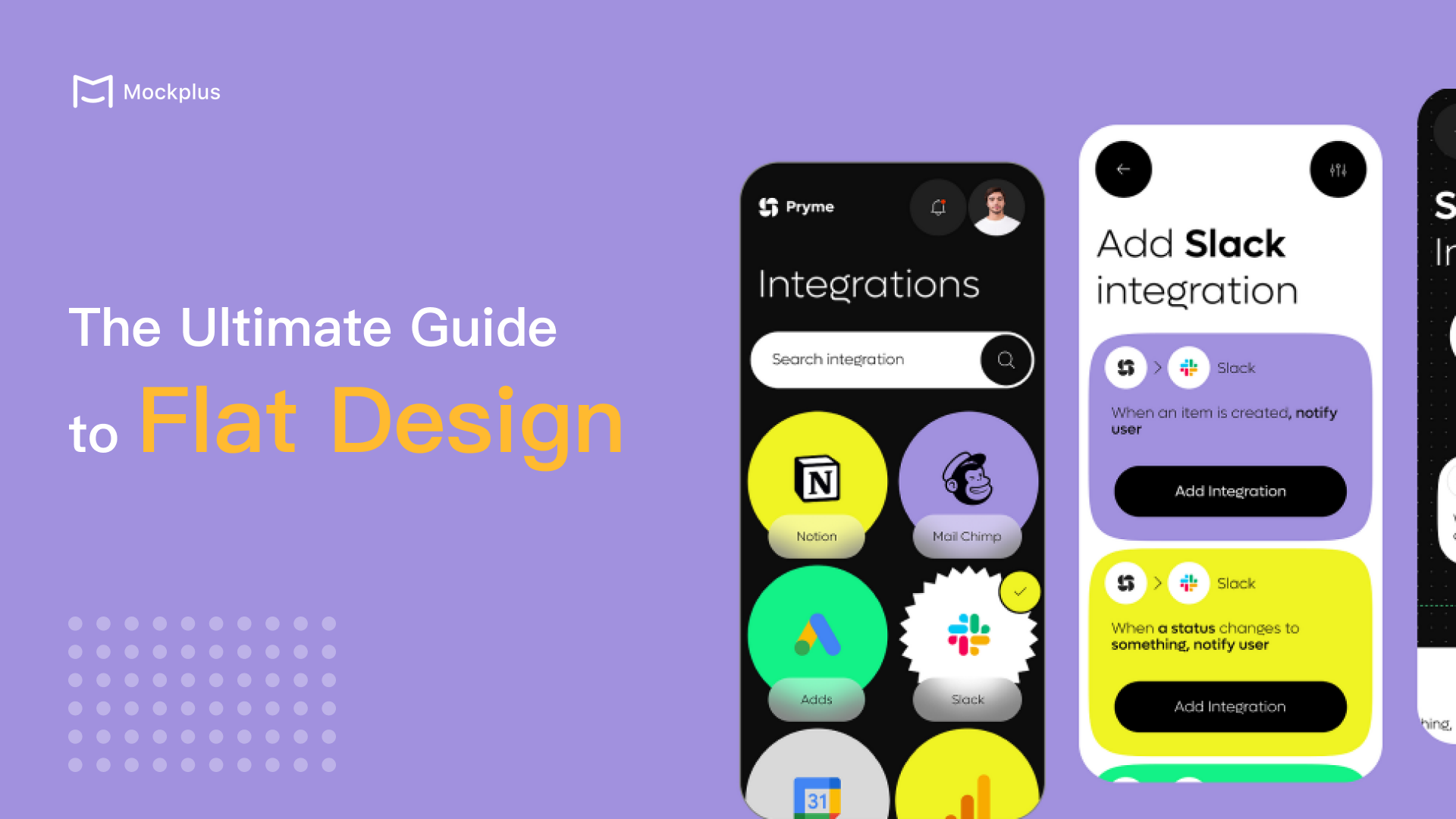
Flat design is a widely embraced approach to web design and app design that emphasize simplicity and functionality by using 2D elements and minimalistic aesthetics. It has gained popularity among major brands for its ability to create a modern, clean, and user-friendly interface.
This article will bring you a comprehensive overview of flat design, exploring its definition and significance in UI/UX design and its pros and cons. Additionally, through a detailed comparison between flat design and material design, you'll gain insights into their key differences. You'll also learn best practices to follow, along with inspiring examples. Also try these design practices out with your free prototyping tool.
Flat design is a minimalist approach to digital design that emphasizes simplicity and clarity by using two-dimensional elements. Rooted in the Swiss design movement, it features clean lines, bold color contrasts, minimalist typography, ample white space, and grid-based layouts.
Popularized by the launch of Windows 8 in 2012 and Apple’s iOS 7 in 2013, flat design quickly became a go-to style for creating modern, user-friendly interfaces. Its emphasis on functionality and speed makes it ideal for delivering information efficiently. Despite its minimalist nature, flat design doesn't entirely abandon skeuomorphic principles but instead reinterprets them in a more simplified and abstract form.
By avoiding complex textures and effects, flat design ensures a clean, fast, and visually appealing user experience, aligning perfectly with the growing trend towards minimalism in digital design.
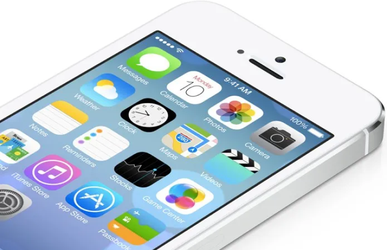
Flat design is defined by several distinctive characteristics that make it both visually appealing and functional:
1.Contrasting colors: Often using bright, bold colors, flat design relies on strong contrasts to guide users' attention and provide clear visual cues.
2.2D styling: Flat design often uses simple, flat shapes with no realistic or 3D effects, creating a straightforward, uncluttered look.
3.Simple typography: In flat design, fonts like sans-serif are typically chosen for their readability, fast loading times, and compatibility with the minimalist aesthetic.
4.White space: In flat design, negative space is often strategically used to enhance readability and focus, making it easier for users to navigate and absorb content.
5.Grid-based layouts: Flat design often employs symmetrical, grid-based layouts that establish a clear visual hierarchy and organized structure.
6.Simplicity: Its style emphasizes simplicity with symbolic icons, abstract forms, and an absence of textures and gradients, keeping the design clean and direct.
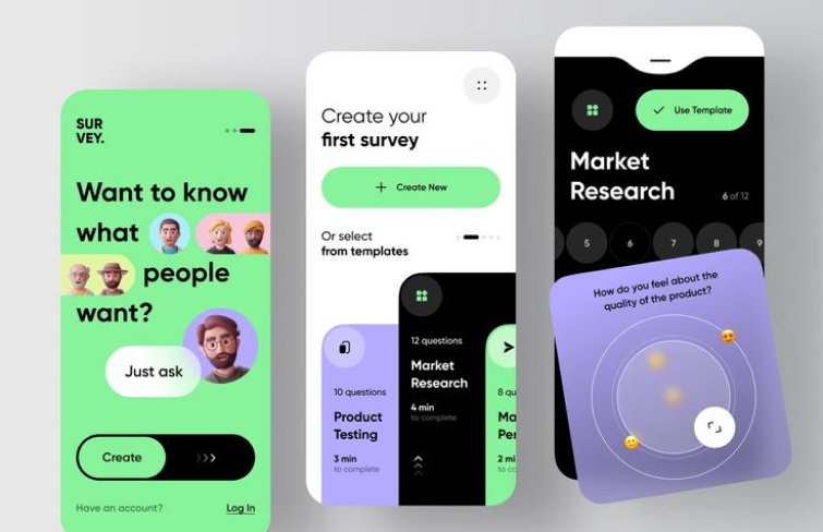
Thanks to its clean and minimalistic aesthetic, flat design has become a popular trend in modern UI/UX. However, its straightforward approach comes with both benefits and drawbacks that can impact user experience and functionality. Here’s some key pros and cons of flat design:
1.Clean and sharp visuals
Flat design stands out for its precise and polished visuals. The minimalist approach applied to icons, shapes, lines, and buttons results in a visually striking appearance. The use of high contrast—through vibrant colors, clear typography, and strong visual elements—enhances the design’s clarity and makes it easy for users to navigate. This combination of sharp details and bold features creates a clean, aesthetically pleasing experience.
2.Enhanced readability and accessibility
Flat design emphasizes straightforward 2D elements, generous use of white space, and clean typography, all contributing to a layout that is easy to read, understand, and navigate. This approach enhances both readability and accessibility by eliminating unnecessary visual clutter.
3.Compatibility with responsive design
Flat design’s use of grid-based layouts and straightforward graphics is especially effective for web and mobile design. These elements are easily adjustable, allowing for seamless resizing and rearrangement to fit various devices and screen sizes, making it easier to achieve a consistent, responsive experience across all platforms.
4.Faster load times
Flat design's commitment to simplicity and minimalism means it avoids complex graphical elements such as intricate textures, gradients, and heavy images. The absence of resource-intensive visual effects not only accelerates page loading but also enhances overall performance across various devices, from smartphones to desktops. This efficiency can lead to a better user experience, lower bounce rates, and improved search engine rankings due to faster load times.
1.Lack distinctiveness
When it comes to visual communication, businesses and brands aim to express their unique identity across various mediums like brochures, websites, or apps. However, one drawback of flat design is the limitations imposed by its minimalist style and rigid guidelines. These constraints often result in designs that lack distinctiveness.
2.Lack of depth and hierarchy
Flat design's minimalistic approach can sometimes result in a lack of visual hierarchy and depth, making it harder for users to distinguish between different elements or understand their importance.
3.Usability challenges
Flat design can struggle in more intricate user experiences, where its minimalist approach may lead to confusion. Research from the Norman Nielsen Group highlights that flat design can reduce usability, as users may not easily identify interactive elements.
4.Lower information density
Information density refers to the quantity of content displayed on a screen or webpage. Flat design, with its focus on minimalism and a clean layout, inherently supports lower information density, prioritizing simplicity and reducing visual clutter, which can impact the overall user experience in some cases.
Flat design excels in communicating messages clearly and efficiently, making it an ideal choice for a variety of applications where simplicity and directness are key. Its minimalist approach, characterized by simple shapes, bold colors, and clean typography, makes it ideal for conveying direct, actionable messages. Its common uses include:
1.Instruction page and tutorials: Flat design works well in guiding users through steps or instructions by keeping the focus on the process without overwhelming them with complex visuals.
2.Infographics: When the goal is to simplify and convey complex data, flat design’s clean visuals make information easily digestible.
3.Advertising: In scenarios where users haven't specifically sought out the material, flat design ensures that the message is clear and straightforward, reducing the cognitive load.
4.Logos and branding: For new or unfamiliar brands, flat design can communicate a business’s identity quickly and effectively, ensuring that the core message is understood at a glance.
5.App icons and mobile interfaces: Flat design’s simplicity suits small-scale elements, providing clarity without over-complicating the user experience, especially in mobile gaming, where the focus is on quick, intuitive interactions.
Overall, flat design may not be ideal for feature-rich, multi-layered interfaces but shines in situations where simplicity, speed, and clarity are paramount.
Flat design and material design are two prominent design philosophies that have shaped modern digital interfaces. While both of them are grounded in simplicity and modern aesthetics, they diverge in their approach to creating user experiences. Flat design is more minimalist, focusing on clarity, speed, and directness. It’s ideal for projects where efficiency and ease of use are paramount. In contrast, material design brings a sense of depth and interaction to digital interfaces.
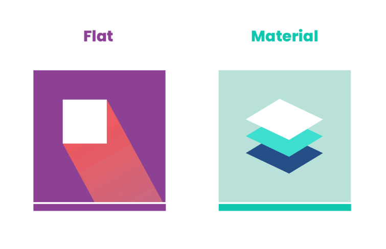
Let’s explore the core aspects of both to understand their differences and applications:
Flat design is minimalistic and two-dimensional, using simple shapes, bold colors, and clean lines to create a straightforward, clutter-free interface. It avoids decorative elements like shadows and textures, focusing on clarity and simplicity.
Material design, originally developed by Google, adds depth and realism to digital interfaces. It uses shadows, layers, and animations to mimic physical materials, creating a more immersive experience. The vibrant color palette and tactile elements make the interface feel dynamic and engaging.
As we mentioned, flat Design enhances usability by eliminating distractions, allowing users to focus on content. However, its minimalism can sometimes obscure interactive elements, leading to potential usability challenges.
Material Design emphasizes user experience with clear visual cues like shadows and animations that guide interactions. It helps users intuitively understand how to navigate the interface, making it ideal for complex user experiences.
Flat Design’s simplicity leads to faster loading times and improved performance, making it suitable for projects where speed is critical. Its lack of resource-intensive elements ensures smooth operation even on less powerful devices.
Material Design’s animations and depth effects can be more demanding on system resources, potentially impacting performance on older devices. While visually engaging, this style requires careful optimization to maintain efficiency.
Flat Design is highly adaptable across different devices, maintaining a consistent appearance due to its minimalist nature. It’s well-suited for responsive design.
Material Design, though responsive, requires more effort to adapt its layered and animated elements across various screen sizes. When done well, it provides a cohesive and visually appealing experience across devices.
When deciding between these two design philosophies, consider the nature of your project and the type of experience you want to deliver. Flat Design excels in straightforward, content-driven applications, while Material Design offers richer, more immersive interaction, ideal for engaging and dynamic interfaces. Both have their strengths, and the choice ultimately depends on your project's specific goals and user needs.
Here are some best practices for creating effective flat designs for your inspiration:
Color is a powerful asset in flat design, allowing you to create visual interest and engagement, bringing vibrancy to your design. Select an appealing color palette and maintain consistency throughout your design to capture and hold users’ attention.
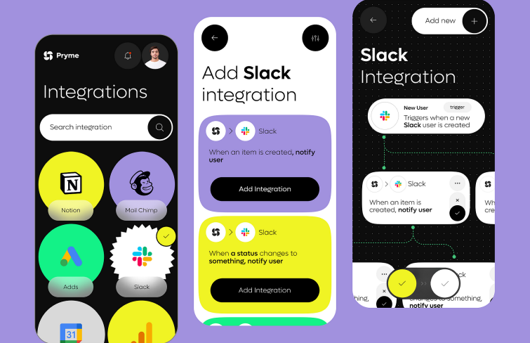
In flat design, achieving the right contrast is crucial for both readability and visual appeal. While using light grey on dark grey may be a popular choice, it often compromises legibility. Without proper contrast, the text can become difficult to discern, leading to a less effective design. You should ensure that there is a clear distinction between design elements for better readability, especially be cautious when overlaying text on background images. You can employ techniques such as using solid color overlays or adjusting image brightness to maintain readability while preserving the aesthetic integrity of the design.
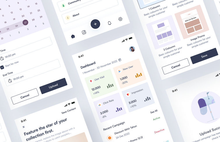
Text often plays a central role in conveying information. It is crucial in establishing a visual hierarchy, guiding users to what matters most on the page. To align with the overall flat design, it’s better to use simple typography because it’s easier to read, allowing users to focus on the content rather than being distracted by elaborate fonts. An overly ornate font can appear out of place within a clean, minimalist layout.
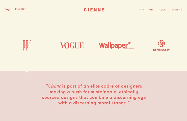
Even with its minimalist nature, flat design can effectively integrate animation to enhance user interaction. Animations can guide users by highlighting buttons, showing the next steps, or drawing attention to key elements. They can also serve to entertain users during loading times or provide immediate feedback. Whether for storytelling, enhancing buttons, logos, or hero images, animation adds a dynamic layer to flat design without compromising its clean aesthetic.
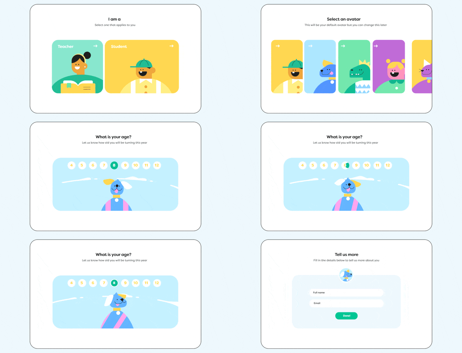
To create the clean, uncluttered look that defines flat design, incorporating ample whitespace is essential. Whitespace, or negative space, is the area around and between elements on a page, providing necessary breathing room. This space enhances the page's readability and makes specific elements more noticeable by allowing them to stand out. Proper use of whitespace not only contributes to a sleek design but also guides the user's focus effectively, reinforcing the overall visual hierarchy.
When using flat design, striking the right balance in information density is crucial. While it's essential to prevent overwhelming users with too much content, it's equally important to avoid leaving them with too little. A minimalist aesthetic shouldn't come at the cost of valuable information. Instead, aim for a medium density that offers users the necessary details without clutter, ensuring that your app or website remains both informative and visually appealing.
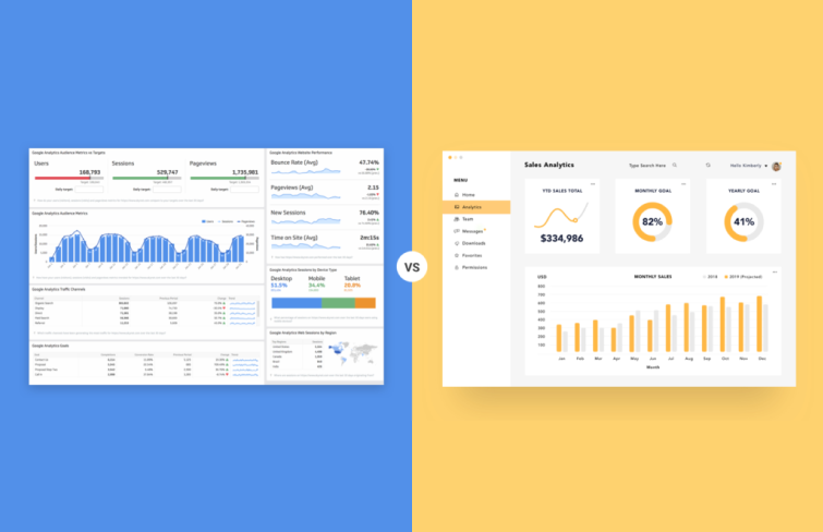
In flat design, the absence of depth can sometimes obscure interactive elements, making them harder for users to identify. To ensure that usability isn't sacrificed for the sake of aesthetics, it's important to include clear visual cues that highlight clickable or interactive areas. These cues help guide users through the interface, making it easier for them to navigate and interact with your design effectively. You can emphasize clickable text by underlining it, like "Sign up here." Other effective cues include changing the color of a button when hovered over, adding icons next to links, or using bold text for key actions. These small touches help users easily identify interactive elements without compromising the clean, minimalist aesthetic.

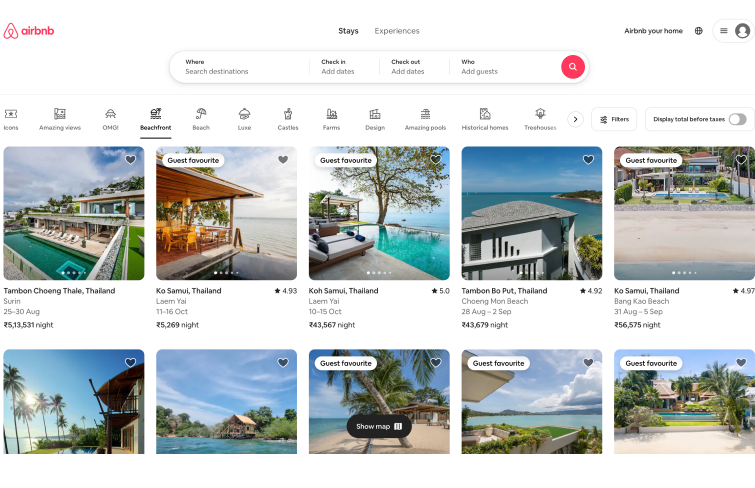
Airbnb’s flat design features a minimalist approach with a focus on large, high-quality images and clean typography. The site eliminates gradients and shadows, favoring flat, simple forms and a limited color palette to enhance user experience. This design strategy prioritizes ease of navigation and helps users quickly find and book accommodations, aligning with the brand’s goal of providing a seamless booking process.
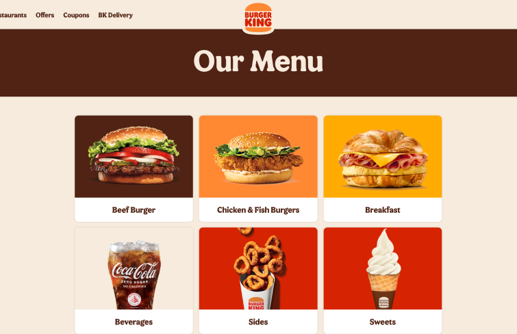
Burger King ’s website embodies flat design through its use of bold, vibrant colors and a straightforward layout that highlights its products without clutter. The brand’s flat design includes a simplified, retro-inspired logo that eliminates 3D effects, focusing on clean lines and a minimalistic aesthetic.
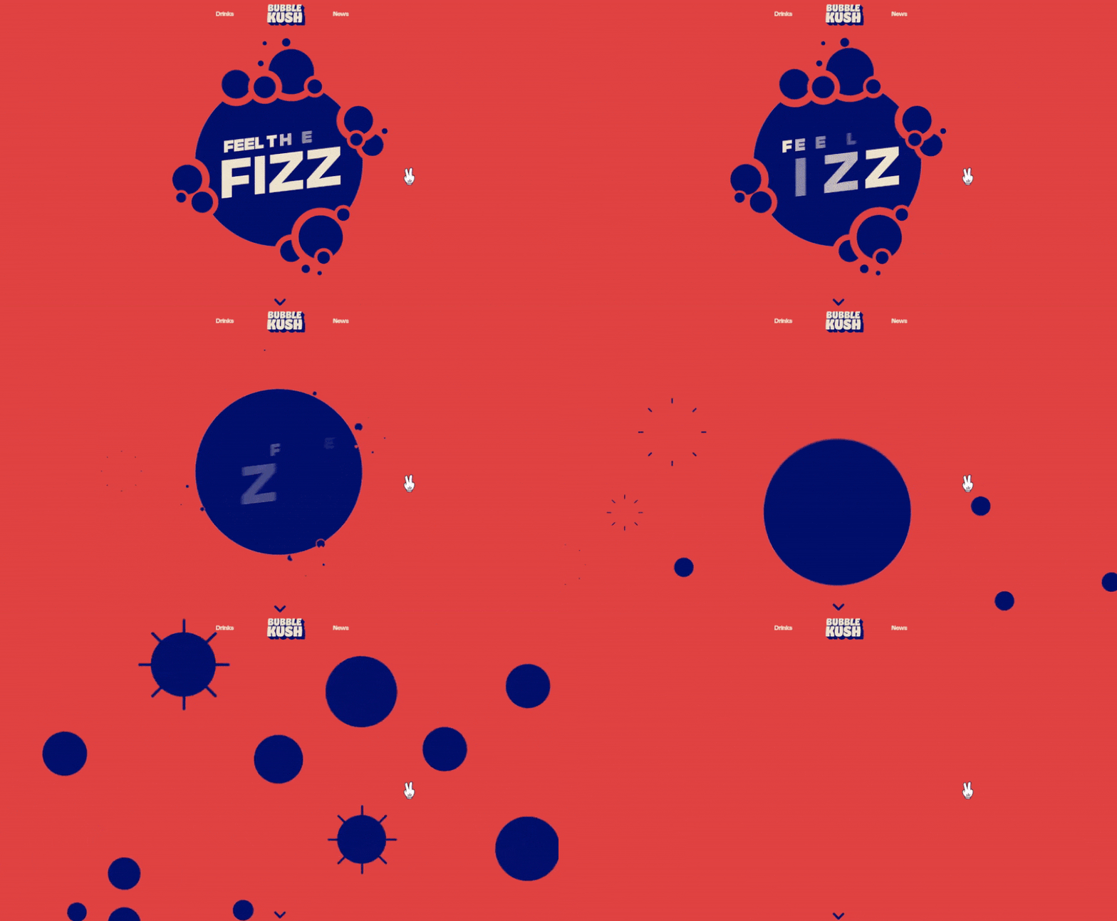
As soon as you land on Bubble Kush's homepage, you immediately crave a cold, sparkling drink. The subtle animation of flat shapes mimicking fizzing bubbles clearly signals that this site is all about a unique cola experience. The blend of minimalist flat design with real product photos adds a casual, fun vibe to the site, keeping things interesting without feeling overdone.
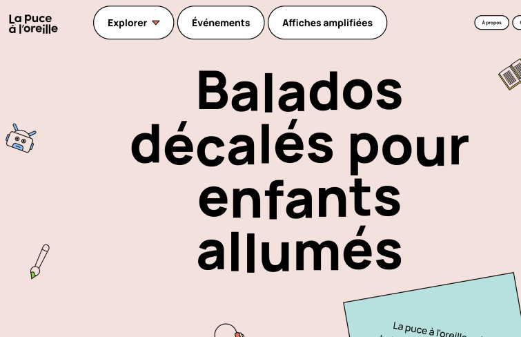
La Puce à l’oreille produces engaging podcasts tailored for kids and teenagers. Their website features a vibrant flat cartoon design, offering podcasts, collaborations, events, and interactive experiences for various age groups, from 4-year-olds to teens. With its creative and playful navigation, presented through interactive shapes and vibrant color, it's a site you won't want to miss exploring.
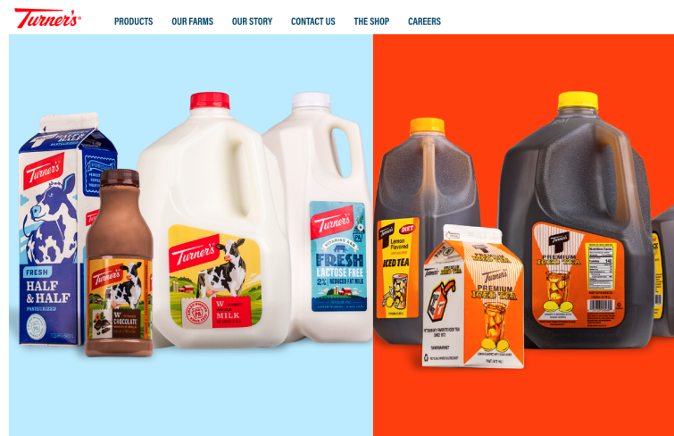
Turner’s Dairy exemplifies traditional flat website design with its bold use of real product images and vivid colors. The site avoids shadows and 3D effects, relying solely on subtle animations for panel and button interactions to signal clickability. This lively, engaging approach proves that a flat design can be visually striking without relying on dimensional elements.
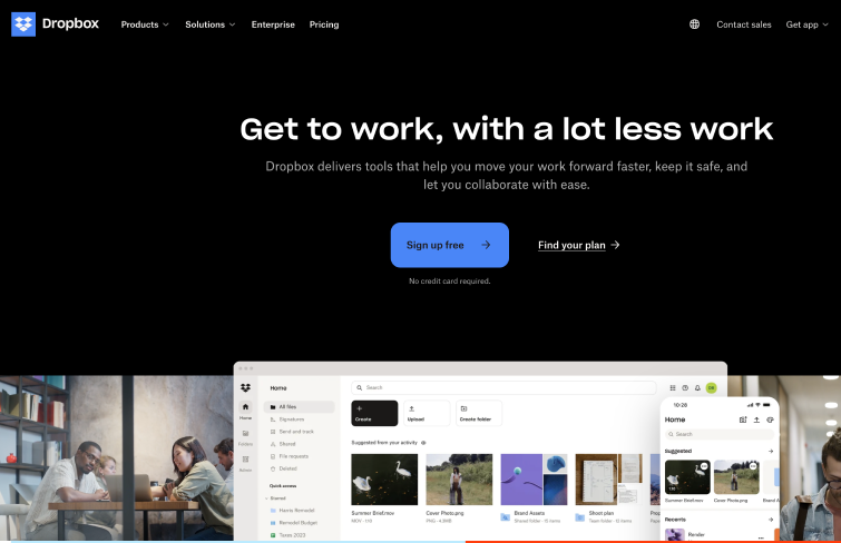
Dropbox exemplifies the principles of flat design, with its streamlined, clutter-free interface, readable typography, and straightforward icons. Its interface clearly distinguishes clickable buttons, and the information is presented with just the right density to effectively inform users about the product's key features. It not only maintains a minimalist aesthetic but also ensures an intuitive and engaging user experience.
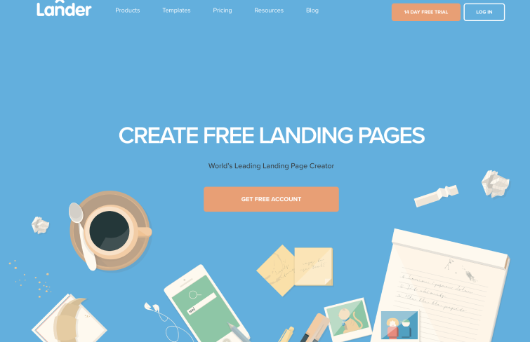
When you visit Lânder’s site, you're greeted by an animated display where various desk items converge at the screen's center. These objects, with their playful, cartoonish style, are enhanced by intricate details. The animation and details work together to create a visually engaging experience right from the start.
Flat design is defined by its commitment to minimalism, focusing on simplicity and clarity. It eliminates three-dimensional effects like gradients, shadows, and textures, opting for clean lines and geometric shapes to reduce visual clutter. The design often features bold, vibrant colors, simple and straightforward typography, simple icons. It emphasizes content by removing unnecessary decorations, ensuring that the user's attention is directed toward the core functionality.
Flat design is often praised for its effectiveness and simplicity. Its minimalist approach eliminates unnecessary elements like gradients and shadows, focusing on clean lines and essential features. Besides, flat design remains a popular choice not just for its functionality but also because it aligns with current design trends. Its clean, modern aesthetic appeals to users who appreciate simplicity and sophistication in digital interfaces, making it a trendy option that resonates with contemporary tastes.
To create a flat design, start with simplicity—remove unnecessary elements like gradients and shadows. Use clean, geometric shapes and choose vibrant colors that make key elements pop. And stick to simple, legible sans-serif fonts for easy reading. Moreover, design icons with basic shapes that are instantly recognizable. Rember to focus on the content by avoiding distractions, and use a grid layout to ensure your design adapts well to different devices. Finally, keep everything lightweight to ensure fast load times and a smooth user experience.
Overall, flat design emphasizes creating a high impact with minimal elements, making it a powerful and effective approach in digital design. Its minimalistic nature not only ensures quick loading times but also enhances readability, which is why it's favored by many leading companies all over the world. So, whether you're reimagining your website or embarking on a new project, exploring flat design could offer a refreshing perspective. We hope this article has sparked inspiration and encouraged you to experiment with flat design to elevate your own web projects.
 Mockplus RP
A free prototyping tool to create wireframes or interactive prototypes in minutes.
 Mockplus DT
A free UI design tool to design, animate, collaborate and handoff right in the browser.
